4.2 Action Property Editor
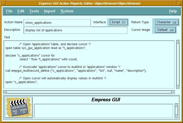 Figure 4-2 Action Property Editor
Purpose
| File | ||
| New | New script action
Create a script action and invoke the Action Editor. |
|
| New C action | Create a C action and invoke the Action Editor. | |
| Copy | Copy an action. A dialog box allows the user to specify the action to be copied, even if it is in another database and/or module. | |
| Delete | Delete the selected action. | |
| Rename | Change the name of the selected action. | |
| Properties | Invoke the Action Editor on the selected action. | |
| Exit | Return to the previous screen. | |
| View | ||
| Refresh | Re-display the list of actions in the module. | |
| Clear Filters | Remove filter and re-display list of actions. | |
| Set Filters | Apply filter (name and/or description) to list of actions. | |
| Tools | ||
| Check Syntax | Checks the syntax of the selected action. Not applicable for C actions. | |
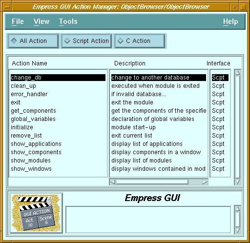
| All | All types of actions are displayed. |
| Script Action | Only scripts are displayed. |
| C action | Only C actions are displayed. |
| Action Name | List of actions defined in the current module. |
| Description | Descriptive comment on the corresponding actions. |
| Interface | Indicates whether the corresponding action is a script or C action. |
| Message field | See Chapter 2 - "Common Elements of Empress GUI Builder Screens". |
4.2 Action Property Editor
Figure 4-2 Action Property Editor
Purpose
For Script actions, the return type can also be set. Scripts can be
imported from text files, or entered directly in the editor's text field.
Called From
| File | ||
| Run | Run the current application. | |
| Run with parameters | Run the application, with parameters obtained from a dialog box. | |
| Save | Save the changes to the database. | |
| Save & Exit | Save the changes and return to the Action Manager screen. | |
| Exit | Return to the Action Manager screen. | |
| Edit | ||
| Clear | Clear the Description and Text fields, set Return Type to "Void", and Cursor Image to "Default". | |
| Reset | Reset all fields and options to original values. | |
| Go to | Scrolls the text field so that the specified line number appears at the top of the field. Not applicable for C actions. | |
| Tools | ||
| Check Syntax | Checks the syntax of the script in the text field. Not applicable for C actions. | |
| Import GUI Script | Invoke a dialog to allow selection of a file (containing Empress GUI Builder Script statements) to be read. Not applicable for C actions. | |
| System | ||
| System Editor | Invoke the system editor ("vi" by default) on the displayed text. Not applicable for C actions. | |
| Action Name | Name of action. It is editable only when defining a new action. |
| Description | Descriptive comment for the action. |
| Interface | Indicates whether the action is Script or C API. |
| Return Type | Data type of result returned: "Boolean", "Character", "Date", "Decimal", "Float", "Integer", "Void". "Void" indicates that the action does not return any result. Not applicable for C actions. |
| Cursor Image | Determines whether the mouse pointer remains unchanged ("Default"), turns into the "watch" ("Wait") or "X" ("Inactive") cursor while the action is executing. |
| Text field | Editable field containing the text of the Script action. For C actions, this field cannot be edited. |
| Message field | See Chapter 2 - "Common Elements of Empress GUI Builder Screens". |
4.3 Syntax Checker
The Syntax Checker is a tool to identify some of the common syntax errors
in a script action, such as missing parentheses, commas and semicolons.
The Syntax Checker can be invoked in several ways:
If syntax errors are found, the Syntax Checker will display a "Syntax Error Detected" message in an information dialog box. Then it displays a window to list the error numbers, the line numbers of the script where it has found the errors and the error messages. The error window is actually a xterm window running the system editor (specified by the Empress system variable MSEDITOR, default is "vi").
Because of parsing limitations, the Syntax Checker is limited in its scope in terms of detecting line numbers of lines with errors. For example, a missing semicolon on line 5 may cause a syntax error to be reported on line 7, where the statement is correctly terminated by a semicolon.
Note that the Syntax Checker will not verify whether function names are valid, since these could be internal Empress SQL functions, Empress GUI Builder script functions, user-defined functions or script actions used as functions.
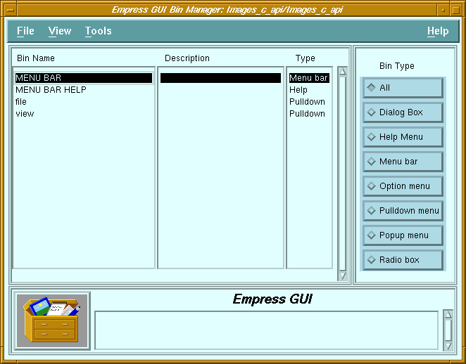 Figure 4-3 Bin Manager
Bins are collections of components defined to share common properties (see the Empress GUI Builder: User's Guide manual for further details).
Double-clicking on a bin will call the Component Editor for the selected
bin.
Called From
| File | ||
| New | Create a bin of the type specified by the Bin Type radio button. Invoke the bin property editor on the new bin. (This function is not available if Bin Type is set to "All"). | |
| Copy | Copy a bin. A dialog box allows the user to specify the bin to be copied, even if it is in another database and/or module. | |
| Delete | Delete the selected bin. | |
| Rename | Change the name of the selected bin. | |
| Properties | Invoke the Bin Property Editor on the selected bin. | |
| Exit | Return to the Application Module Manager screen. | |
| View | ||
| Refresh | Re-display the list of bins of the selected type. | |
| Clear Filters | Remove filter (and display complete list of bins of the selected type). | |
| Set Filters | Apply filter (name and/or description) to list of bins. | |
| Tools | ||
| Bin Component Editor | Invoke the Component Editor for the specified type of bin. | |
| Bin Name | List of bins of the selected type contained in the current module. |
| Description | Descriptive comment for the corresponding bins. |
| Type | Indicates the type of the corresponding bin. |
| Bin Type buttons | Choice of available bin types (or all). |
| Message field | See Chapter 2 - "Common Elements of Empress GUI Builder Screens". |
4.5 Bin Property Editor
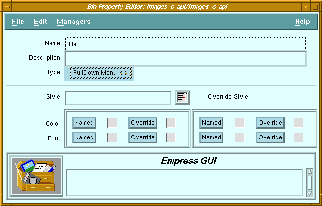 Figure 4-4 Bin Property Editor
Purpose
Bins are collections of components defined to have common properties
(see the Empress GUI Builder: User's Guide manual for further details).
It uses the same common elements as the component property editors. The
bin type cannot be changed. It is set when the bin is created (in the Bin
Manager). The contents of a bin is not specified is the Bin Property Editor.
This is done in the Bin Component Editor.
Called From
| File | ||
| Run | Run the current application. | |
| Run with parameters | Run the application, with parameters obtained from a dialog box. | |
| Save | Save the changes to the database. | |
| Save & Exit | Save the changes and return to the Bin Manager screen. | |
| Exit | Return to the Bin Manager screen. | |
| Edit | ||
| Clear All Fields | Clears the Description and Style fields as well as all style settings. | |
| Reset All Fields | Reset all fields and style settings to original values. | |
| Clear Override Style | Clear the settings in the Override Style section. Managers | |
| Object Style Manager | Invoke the Style Manager for bins. | |
| Font Style Manager | Invoke the Style Manager for fonts. | |
| Color Style Manager | Invoke the Style Manager for colors. | |
| Name | Name of the bin |
| Description | Descriptive comment for the bin |
| Type | Identifies the type of bin. |
| Message field | See Chapter 2 - "Common Elements of Empress GUI Builder Screens". |
4.6 Hypertext Manager
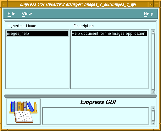
Figure 4-5 Hypertext Manager
Purpose
Called From
Calls
Hypertext Property Editor
Menu Options
| File | ||
| New | Create new hypertext document and invoke the Hypertext Property Editor. | |
| Copy | Copy a hypertext document. A dialog box allows the user to specify the document to be copied, even if it is in another database and/or module. | |
| Delete | Delete the selected hypertext document. | |
| Rename | Change the name of the selected hypertext document. | |
| Properties | Invoke the Hypertext Property Editor on the selected hypertext document. | |
| Exit | Return to the Application Module Manager screen. | |
| View | ||
| Refresh | Re-display the list of hypertext documents in module. | |
| Clear Filters | Remove filter (and display complete list of hypertext documents). | |
| Set Filters | Apply filter (name and/or description) to list of hypertext documents. | |
| Name | List of hypertext documents contained in module. |
| Description | Descriptive comment for the corresponding documents. |
| Message field | See Chapter 2 - "Common Elements of Empress GUI Builder Screens". |
4.7 Hypertext Property Editor
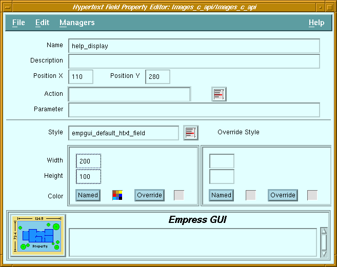 Figure 4-6 Hypertext Property Editor
Purpose
Called From
Calls
Menu Options
| File | ||
| Run | Run the current application. | |
| Run with parameters | Run the application, with parameters obtained from a dialog box. | |
| Save | Save the changes to the database. | |
| Save & Exit | Save the changes and return to the Application Module Manager screen. | |
| Exit | Return to the Application Module Manager screen. | |
| Edit | ||
| Clear | Clear all fields. | |
| Reset | Reset all fields to original values. | |
| Import | ||
| Hypertext | Invoke a dialog to allow selection of a file (containing a hypertext document) to be read. | |
| System | ||
| Editor | Invoke system editor on the contents of the Text field. | |
| Name | Name of hypertext document. |
| Description | Descriptive comment on the document. |
| Text field | Contents of the document. |
| Message field | See Chapter 2 - "Common Elements of Empress GUI Builder Screens". |
4.8 Pixmap Manager
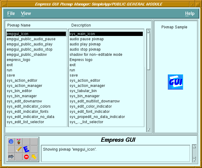 Figure 4-7 Pixmap Manager
Purpose
Called From
Calls
Menu Options
| File | ||
| New | Add a new pixmap to the module. | |
| Copy | Copy a pixmap. A dialog box allows the user to specify the pixmap to be copied, even if it is in another database and/or module. | |
| Delete | Delete the selected pixmap. | |
| Rename | Change the name of the selected pixmap. | |
| Properties | Invoke the Pixmap Property Editor on the selected pixmap. | |
| Exit | Return to the previous screen. | |
| View | ||
| Refresh | Re-display the list of pixmaps in the module. | |
| Clear Filters | Remove filter (and display complete list of pixmaps). | |
| Set Filters | Apply filter (name and/or description) to list of pixmaps. | |
| Pixmap Name | List of pixmaps contained in the module. |
| Description | Descriptive comment for the corresponding pixmaps. |
| Pixmap sample | Picture of the selected pixmap. |
| Message field | See Chapter 2 - "Common Elements of Empress GUI Builder Screens". |
| File | ||
| Run | Run the current application. | |
| Run with parameters | Run the application, with parameters obtained from a dialog box. | |
| Save | Save the changes to the database. | |
| Save & Exit | Save the changes and return to the Application Module Manager screen. | |
| Exit | Return to the Pixmap Manager screen. | |
| Edit | ||
| Clear | Clear the fields and the pixmap sample. | |
| Reset | Set the fields and pixmap sample to original values. | |
| Import | ||
| Empress Pixmap | Invoke a dialog to allow selection of a file (containing an Empress pixmap) to be read. | |
| XPM Pixmap | Invoke a dialog to allow selection of a file (containing a pixmap in XPM format ) to be read. | |
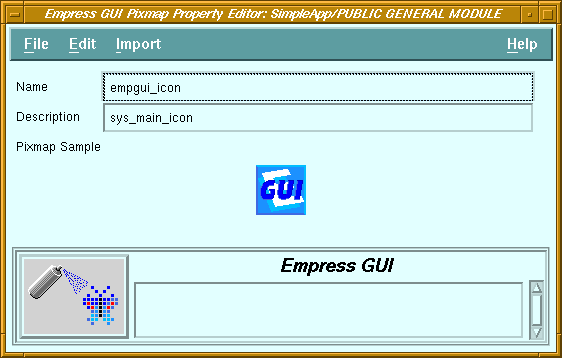
| Name | Only editable when defining a new pixmap. |
| Description | Descriptive comment for the pixmap. |
| Pixmap Sample | Area displaying the pixmap. |
| Message field | See Chapter 2 - "Common Elements of Empress GUI Builder Screens". |
4.10 Style Manager
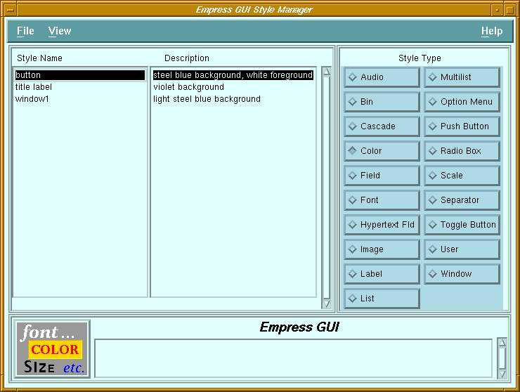 Figure 4-9 Style Manager
Purpose
Called From
Calls
Menu Options
| File | ||
| New | Create a new style to the module. The type of style created depends on the setting of the Style Type radio box. | |
| Copy | Copy a style. A dialog box allows the user to specify the style to be copied, even if it is in another database and/or module. | |
| Delete | Delete the selected style. | |
| Rename | Change the name of the selected style. | |
| Properties | Invoke the Style Editor on the selected style. | |
| Exit | Return to the previous screen. | |
| View | ||
| Refresh | Re-display the list of styles. | |
| Clear Filters | Remove filter (and display complete list of styles of the specified type). | |
| Set Filters | Apply filter (name and/or description) to list of styles. | |
| Style Name | List of styles in the current module. |
| Description | Descriptive comment for the corresponding styles. |
| Style Type | Specifies type of style to display. |
| Message field | See Chapter 2 - "Common Elements of Empress GUI Builder Screens". |
4.11 Window Manager
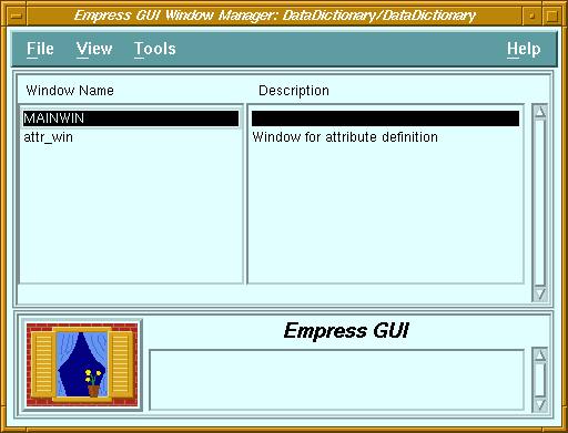
Figure 4-10 Window Manager
Purpose
A module which can be executed must have a main window named "MAINWIN". This main window will define the dimensions of the module when it is invoked. On the other hand, a shareable module which is only used as a library of actions, pixmaps etc. does not require a main window.
Double-clicking on a window name invokes the Window Component Editor, for editing the layout of the components in that window.
Called From
Calls
Menu Options
| File | ||
| New | Add a new window to the module. | |
| Copy | Copy a window. A dialog box allows the user to specify the window to be copied, even if it is in another database and/or module. | |
| Delete | Delete the selected window. | |
| Rename | Change the name of the selected window. | |
| Properties | Invoke the Window Property Editor on the selected window. | |
| Exit | Return to the previous screen. | |
| View | ||
| Refresh | Re-display the list of windows in the module. | |
| Clear Filters | Remove filter (and display complete list of windows). | |
| Set Filters | Apply filter (name and/or description) to list of windows. | |
| Tools | ||
| Window Component Editor | Invoke the Window Component Editor on the selected window. | |
| Window Name | List of windows defined in the module. |
| Description | Descriptive comment for the corresponding windows. |
| Message field | See Chapter 2 - "Common Elements of Empress GUI Builder Screens". |
4.12 Window Property Editor
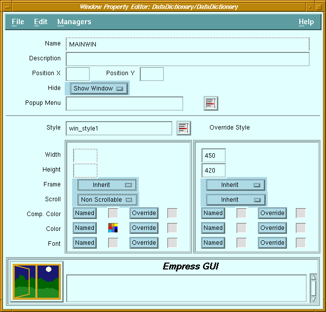 Figure 4-11 Window Property Manager
Purpose
A window is a rectangular area which contains objects called components. It may be shown or hidden by the application, except the main window of a module, which cannot be hidden.
The main window of a module is a special window. It is always called MAINWIN, and it acts as the parent (container) of all the other windows in the module. The X and Y positions are irrelevant for the main window, and its width and height dictate the size of the module window frame when the module is executed.
A window may have a pop-up menu, which is activated when the third mouse button is pressed while the mouse pointer is in the window.
Called From
Calls
Menu Options
| File | ||
| Run | Run the current application. | |
| Run with parameters | Run the application, with parameters obtained from a dialog box. | |
| Save | Save the changes to the database. | |
| Save & Exit | Save the changes and return to the Bin Manager screen. | |
| Exit | Return to the Bin Manager screen. | |
| Edit | ||
| Clear All Fields | Clears the Description and Style fields as well as all style settings. | |
| Reset All Fields | Reset all fields and style settings to original values. | |
| Clear Override Style | Clear the settings in the Override Style section. | |
| Managers | ||
| Object Style Manager | Invoke the Style Manager for windows. | |
| Font Style Manager | Invoke the Style Manager for fonts. | |
| Color Style Manager | Invoke the Style Manager for colors. | |
| Name | Name of this window. |
| Description | Descriptive comment for this window. |
| Position X | Distance (in pixels) between the left edge of this window and the left edge of the module's main window. |
| Position Y | Distance (in pixels) between the top edge of this window and the top edge of the module's main window. |
| Hide | Default state of window: visible or hidden. |
| Pop-up menu | Name of pop-up menu associated with this window. |
| Menu list button | Displays a list of pop-up menus defined in this module or in other shared modules. |
| Frame | Specifies whether the window should have a thin frame around it. |
| Scroll | Specifies whether the window should have vertical and horizontal scroll bars. |
| Component Color | Default color for objects contained in this window. |