5.6 Common Elements of Component Property Editors
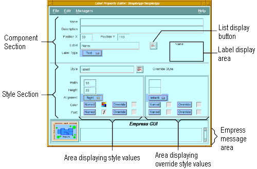
Figure 5-3 Common Elements
Several properties of the components are common to all or some of them. To eliminate redundancy, these properties have been described once, at the beginning of the chapter. Only the unique properties of each component are subsequently described in detail.
Purpose
The Component Editor also provides access to the various component property editors, for customizing the appearance and behaviors of components.
Called From
Menu Options
| File | ||
| Properties | Invoke property editor for the selected component | |
| Run | Run the current application. | |
| Run with parameters | Run the application, with parameters obtained from a dialog box. | |
| Save | Save the changes to the database. | |
| Save & Exit | Save the changes and return to the previous screen. | |
| Exit | Return to the previous screen. | |
| Edit | ||
| Delete | Delete selected component. | |
| Default Style | Invoke the application default style setup. | |
| Arrange | ||
| Lower | The selected component will appear below any other overlapping component. | |
| Raise | The selected component will appear on top of other overlapping components. | |
| Resize to Smallest | Components in the group are resized to the smallest width and height. | |
| Resize to Largest | Components in the group are resized to the largest width and height. | |
| Align Left | Components in the group are positioned so that their left sides are aligned. | |
| Align Right | Components in the group are positioned so that their right sides are aligned. | |
| Align Top | Components in the group are positioned so that their top sides are aligned. | |
| Align Bottom | Components in the group are positioned so that their bottom sides are aligned. | |
| Horizontal Center | Components in the group are positioned so that they are horizontally centered. | |
| Vertical Center | Components in the group are positioned so that they are vertically centered. | |
| Align to Grid | Re-position component so that the top and left sides are aligned to the nearest grid lines. | |
| Grid Spacing | Set horizontal and vertical grid spacing in pixels. The grid lines are not visible. | |
| Snap to Grid | If this toggle button is set, components will always be placed so that their top and left sides are aligned to grid lines. | |
| Managers | ||
| Action Manager | Invoke the Action Manager. | |
| Pixmap Manager | Invoke the Pixmap Manager. | |
| Style Manager | Invoke the Style Manager. | |
| Font Style Manager | Invoke the Style Manager, with the Style radio button set to "Font". | |
| Color Style Manager | Invoke the Style Manager, with the Style radio button set to "Color". | |
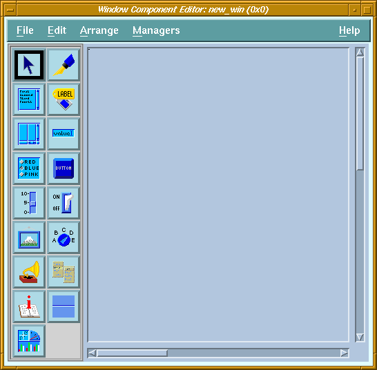
Components are picked up from the toolbar and placed on the drawing area. If a component is placed by a single-click of the first mouse button, it inherits the default style (which includes properties such as size, color, font) for that type of component. If it is placed by clicking and dragging, it does not inherit the default style. The dragging action causes a "rubber band" box to appear, and when the mouse button is released, the component assumes the dimensions of the rubber band box.
| Properties | Invoke property editor for the selected component. | |
| Lower | The selected component will appear below any other overlapping component. | |
| Raise | The selected component will appear on top of other overlapping components. | |
| Align | ||
| Align Left | Components in the group are positioned so that their left sides are aligned. | |
| Align Right | Components in the group are positioned so that their right sides are aligned. | |
| Align Top | Components in the group are positioned so that their top sides are aligned. | |
| Align Bottom | Components in the group are positioned so that their bottom sides are aligned. | |
| Horizontal Center | Components in the group are positioned so that they are horizontally centered. | |
| Vertical Center | Components in the group are positioned so that they are vertically centered. | |
| Align to Grid | Re-position component so that the top and left sides are aligned to the nearest grid lines. | |
| Managers | ||
| Action Manager | Invoke the Action Manager | |
| Pixmap Manager | Invoke the Pixmap Manager | |
| Style Manager | Invoke the Style Manager | |
| Font Style Manager | Invoke the Style Manager, with the Style radio button set to "Font". | |
| Color Style Manager | Invoke the Style Manager, with the Style radio button set to "Color". | |
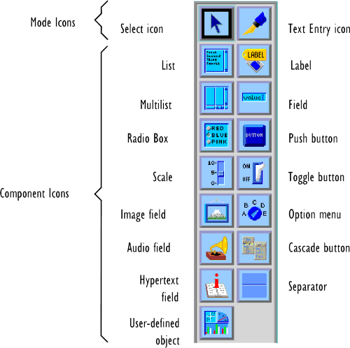
| List | Scrollable list of items. |
| Multilist | Multiple synchronized scrolling lists. |
| Radio Box | Set of mutually exclusive choices. |
| Scale | Numeric slider control. |
| Image | Picture display area. |
| Audio | Sound controller (with Play, Pause and Stop buttons). |
| Hypertext Field | Field for displaying hypertext documents. |
| User-defined Object | Blank canvas that the user can use as a drawing area or manager widget in a program using the C API. |
| Label | Text or pixmap label. |
| Field | Text data field. |
| Push Button | Push button control. |
| Toggle Button | Two-state button control. |
| Option Button | Button for selecting from a menu of choices. |
| Cascade Button | Button for displaying a pull-down menu. This component is only available when editing a menu. |
| Separator | Horizontal or vertical line. |
5.6 Common Elements of Component Property Editors
Figure 5-3 Common Elements
Purpose
All Component Property Editor windows contain two sections, the component section and the style section. Most property editors have certain elements in common. To save unnecessary repetition, these common elements are described here.
Menu bar options
| File | ||
| Set | Save changes. | |
| Set & Exit | Save changes and return to Component Editor. | |
| Exit | Return to Component Editor. | |
| Edit | ||
| Clear All Fields | Clear all displayed values. | |
| Reset All Fields | Reset all displayed values to saved values. | |
| Clear Override Style | Clear values in override style section. | |
| Managers | ||
| Action Manager | Invoke the Action Manager. | |
| Pixmap Manager | Invoke the Pixmap Manager. | |
| Object Style Manager | Invoke the Style Manager. | |
| Font Style Manager | Invoke the Style Manager, with the Style radio button set to "Font". | |
| Color Style Manager | Invoke the Style Manager, with the Style radio button set to "Color". | |
5.7 Component Section
The component section describes properties unique to the individual component.
Components in a window should not normally have the same values for these
properties. For example, if two fields have the same X and Y values, one
will overlap the other. Or if two buttons have the same label, the user
will not be able to distinguish between the two buttons.
5.7.1 Elements Common to All Types of Components
| Name | The name of the component identifies it to user routines. It is not required for some components. |
| Description | Descriptive comment for the component. |
| Position X | The distance between the left edge of the component and the left edge of the window (in pixels). |
| Position Y | The distance between the top edge of the component and the top edge of the window (in pixels). |
| Labels | Some components (labels and buttons) have labels, which may be text or icons (pixmaps). Those that have them will have these four elements on the editor window for each label: |
| Label | The text string or the name of the pixmap to display on the component. |
| Label Type | Option button to choose text or pixmap type labels. |
| List button | If label type is pixmap, this button will pop up a list of pixmaps
available in the current module and in other shareable modules in the application.
Label display
If label type is pixmap, the selected pixmap (if it exists) is displayed here. |
| Actions | Some components can invoke actions under certain circumstances (e.g., when a push button is clicked). A component may have one or more actions associated with it, each of which will have these three elements on the editor window: |
| List button | Pops up a list of actions available in the current module and other shareable modules in the application. Selecting one of these actions causes its name to be copied to the action field. |
| Parameter | Text passed to the action as an argument. The string value is taken as a single parameter by the action. |
The style section specifies the styles to be used with the component
being edited. It consists of two parts: the one on the left is related
to a named style, the one on the right is related to an override (unnamed)
style for the component.
| Named Style | This part of the style section displays values set according to the named style selected. Only the Style field can be edited. | |
| Style | Name of style to use. | |
| List button | Pops up a list of style names from which a style can be selected. | |
| Width | Width of the component (in pixels) as defined in the style. | |
| Height | Height of the component (in pixels) as defined in the style. | |
| Color: | ||
| Named | This button displays the named color style defined in the selected style. If there is a named color style, the icon next to the button is a colored check board. Otherwise, the icon is blank. | |
| Override | This button displays the override color style defined in the selected style. If there is an override color style, the icon next to the button is a colored check board. Otherwise, the icon is blank. | |
| Font: | ||
| Named | This button displays the named font style defined in the selected style. If there is a named font style, the icon next to the button is an italic " f ". Otherwise, the icon is blank. | |
| Override | This button displays the override font style defined in the selected style. If there is an override font style, the icon next to the button is an italic " f ". Otherwise, the icon is blank. | |
| Override Style | This part of the style section allows the user to override the values specified by the named style (if selected). For height or width, a null value causes the named style specified dimension to be used. If both the override and named style dimensions are null, then the dimension will depend on other properties of the component, such as the label, font, etc. | |
| Width | Width of the component (in pixels). | |
| Height | Height of the component (in pixels) as defined in the style. | |
| Color: | ||
| Named | This button allows a named color style to be selected. If a named color style has been selected, the icon next to the button is a colored check board. Otherwise, the icon is blank. | |
| Override | This button allows specific colors to be selected as override. If override colors have been selected, the icon next to the button is a colored check board. Otherwise, the icon is blank. | |
| Font: | ||
| Named | This button allows a named font style to be selected. If a named font style has been selected, the icon next to the button is an italic " f ". Otherwise, the icon is blank. | |
| Override | This button allows a specific font to be selected as override. If an override font has been selected, the icon next to the button is an italic " f ". Otherwise, the icon is blank. | |
5.8 Audio Field Property Editor
 Figure 5-4 Audio Field Property Editor
Purpose
The audio object can be assigned audio data in one of the supported formats (AIFF, AU, ...) stored in an Empress table using the bulk data type. The audio data is automatically translated and played on the appropriate sound device. The audio object has three push buttons to control the playback of sound:
| Play | Play button: Start or continue playing the sound. |
| Pause | Pause button: Halt the playback. If Play is subsequently pressed, the playback will resume from the point where it was paused. |
| Stop | Stop button: Stop the playback. If Play is subsequently pressed, the playback will restart from the beginning. |
| Name | The name is needed for the application to assign data to the audio field. |
| Description | Descriptive comment for the audio field. |
| Position X | Distance from left edge of window. |
| Position Y | Distance from top edge of window. |
| Label | Text or pixmap displayed above the controller buttons. |
| Play Label | Text or pixmap displayed on the Play button (leftmost) |
| Pause Label | Text or pixmap displayed on the Pause button (middle) |
| Stop Label | Text or pixmap displayed on the Stop button (right) |
| Autoplay | Determines if playback should start automatically when data is assigned to the audio field, or only when the Play button is pressed (default). |
5.9 Cascade Button Property Editor
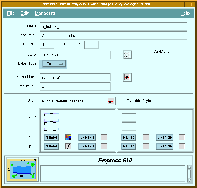 Figure 5-5 Cascade Button Property Editor
Purpose
In a menu-bar, a cascade button is used to display a pull-down menu. It looks like a label, and when it is selected, the associated pull-down menu appears below it.
When used in a pull-down or pop-up menu, it is used to display another pull-down menu (sometimes called a cascading menu). It looks like a push button with a label and a triangular indicator on the right. When it is selected, the associated menu appears on the right side of the button. Cascade buttons can have mnemonic letters which are used to activate the button when the button is visible. If the button is in the menu-bar, then the mnemonic letter has to be pressed while the <Alt> key is held. Note that only one cascade button should be associated to a particular pull-down menu.
Screen Elements
| Name | Not required for cascade buttons. |
| Description | Descriptive comment for the button. |
| Position X | Distance from left edge of window. |
| Position Y | Distance from top edge of window. |
| Mnemonic | Mnemonic letter which can be used to activate the button. |
| Label | Text or name of pixmap to display on button. |
| Label Type | Specifies whether label is text or pixmap. |
| Label list button | Displays a list of pixmaps available. |
| Label display | Displays the text or pixmap selected. |
5.10 Field Property Editor
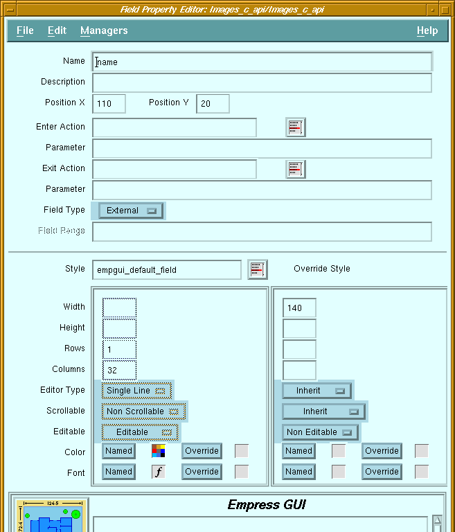 Figure 5-6 Field Property Editor
Purpose
Fields are used for display and/or input of text data. They may allow single or multiple lines, with or without word-wrap. They may be editable or display-only.
Screen Elements
| Name | The name is needed for the application to read and change the contents of the field. |
| Description | Descriptive comment for the field. |
| Position X | Distance from left edge of window. |
| Position Y | Distance from top edge of window. |
| Enter Action | Name of action to be invoked whenever the field becomes current (i.e., when input focus is set to the field, which can be achieved by clicking on the field). |
| Enter Action list button | Displays a list of actions available. Selecting one of these actions causes its name to be copied to the Enter Action field. |
| Parameter | Optional constant string passed as argument to the enter action when it is called. |
| Exit Action | Name of action to be invoked whenever the field is exited (i.e., when input focus is taken away from the field, which can be achieved by clicking on another object). |
| Exit Action list button | Displays a list of actions available. Selecting one of these actions causes its name to be copied to the Exit Action field. |
| Parameter | Optional constant string passed as argument to the exit action when it is called. |
| Field type | Specifies the data type of the contents of the field. This information is used only by Script actions. |
| Field range | (Reserved for future use). |
| Rows | Height of field in terms of rows (lines) of text. This value is taken in consideration only if "Height" is set to null. | |
| Columns | Width of field in columns (characters). This value is taken into consideration
only if "Width" is set to null.
(If the size of a field is defined in terms of Rows and Columns, the actual dimensions will depend on the font used for the field). |
|
| Editor type: | ||
| Single Line | Only one line of text can be entered in the field. The <Enter> key will cause a field exit. This does not prevent the field from displaying text on several lines, if the text is assigned to the field by the application. | |
| Multiline | The field allows multiple lines to be entered and displayed. The <Enter> key causes a new line to be inserted in the text. | |
| Word Wrap | The field allows multiple lines to be entered and displayed. It will automatically perform word-wrapping on lines which are longer than the field width. | |
| Scrollable | A single-line scrollable field has a horizontal scroll bar. A multiline scrollable field has horizontal and vertical scroll bars. A word-wrapped scrollable field has a vertical scroll bar only. | |
| Editable | An editable field allows the user to enter data. Although input focus can be set to a non-editable field, the user cannot enter data; it can only display data assigned by the program. | |
5.11 Hypertext Field Property Editor
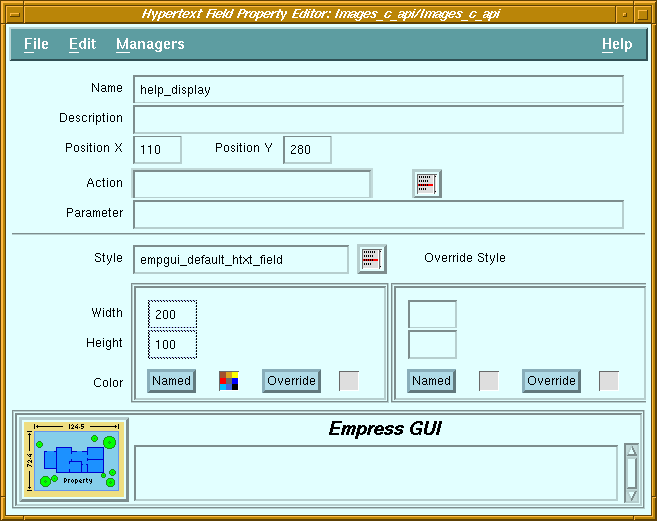 Figure 5-7 Hypertext Field Property Editor
Purpose
The hypertext field is a scrollable display-only field used for viewing hypertext documents. It will translate HTML hypertext commands embedded in the document, such as use of different fonts for headings, use of appropriate indentation for lists, highlighting words through the use of bold or italic fonts, etc.
By default, selecting a link in a document displayed in the field will cause another document (referenced by the link) to be displayed in the field.
Screen Elements
| Name | The name is needed for the application to assign hypertext documents to the field. |
| Description | Descriptive comment for the hypertext field. |
| Position X | Distance from left edge of window. |
| Position Y | Distance from top edge of window. |
| Action | No action should be specified if the default behavior of links is desired. If the name of an action is specified, selecting a link will invoke that action, and the name of the referenced document will be passed as parameter. |
| Parameter | (Reserved for future use) |
5.12 Image Field Property Editor
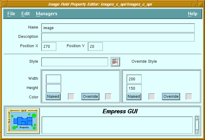 Figure 5-8 Image Field Property Editor
Purpose
The image field is used for displaying images, stored in GIF format in a table using an attribute of bulk data type. When the image data is assigned to the image field, the data is automatically translated into a picture. Image fields are non-editable and do not have associated actions, since they are used for display purposes only.
Screen Elements
| Name | The name is needed for the application to assign data to the image field. |
| Description | Descriptive comment for the image field. |
| Position X | Distance from left edge of window. |
| Position Y | Distance from top edge of window. |
5.13 Label Property Editor
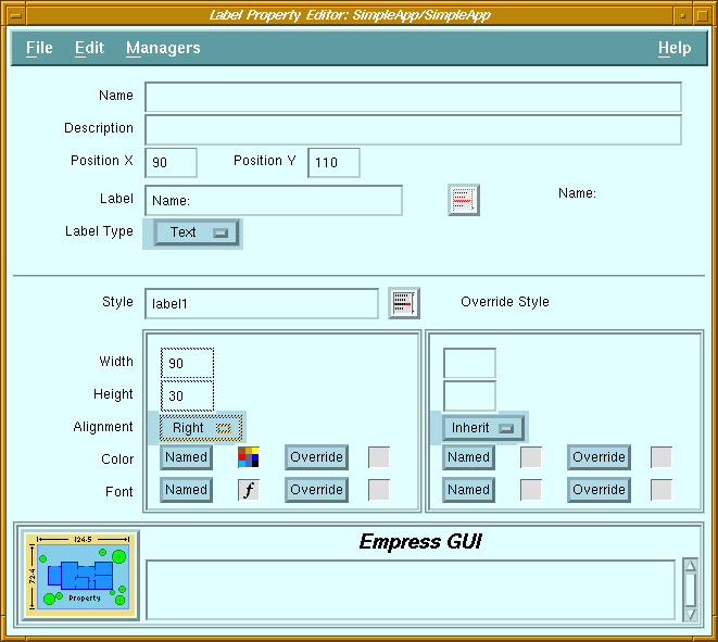 Figure 5-9 Label Property Editor
Purpose
Labels are areas on the screen which are used to display text or icons. They may be used for titles, captions, logos, or any text that does not change.
Screen Elements
| Name | Not required for labels. |
| Description | Descriptive comment for the label. |
| Position X | Distance from left edge of window. |
| Position Y | Distance from top edge of window. |
| Label | Text or name of pixmap to display. |
| Label Type | Specifies whether label is text or pixmap. |
| Label list button | Displays a list of pixmaps available. |
| Label display | Displays the text or pixmap selected. |
| Alignment | Label text may be aligned left, right or centered within the label area. |
5.14 List Property Editor
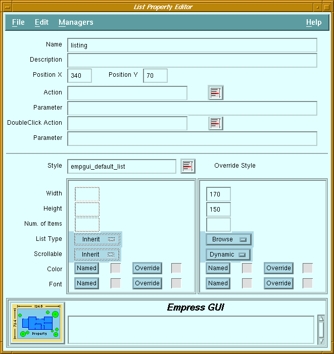 Figure 5-10 List Property Editor
Purpose
A list displays a single column of text items, which can be selected or de-selected by clicking with the mouse (selected items are highlighted). Although the dimensions of a list are usually fixed, the number of items that a list contains can vary. Lists may have scroll bars. Vertical scroll bars are useful when the height of the list is not enough to display all the items.
Horizontal scroll bars allow scrolling of text items which are longer than the list width. Scroll bars may be constant (always visible), or dynamic (only shown when needed). The selection policy of a list (list type) determines how items are selected and de-selected with the mouse button.
Screen Elements
| Name | The name is needed for the application to set the items of a list, and to get the selected item(s). |
| Description | Descriptive comment for the list. |
| Position X | Distance from left edge of window. |
| Position Y | Distance from top edge of window. |
| Action | Name of the action associated with a single-click of the mouse on an item. |
| Action button | Displays a list of available actions. |
| Parameter | Optional constant string passed as argument to the action. |
| DoubleClick Action | Name of the action associated with a double-click of the mouse on an item. |
| DoubleClick Action button | Displays a list of available actions. |
| Parameter | Optional constant string passed as argument to the double-click action. |
| Number of Items | Number of visible items (alternative to Height in pixels). If a non-null value is specified, Height will automatically be set to null. The actual height of the list will depend on the font used. | ||
| List Type: | Specifies the selection policy for the list. | ||
| Single | Allows zero or one selected item. Clicking on an item toggles its selection state (i.e., if it was selected, it becomes unselected, and vice versa), and de-selects any other selected item. | ||
| Browse | Allows only one selected item. Clicking on an item selects it, and de-selects any other item. Unlike the Single policy, if the item was selected, it will not be de-selected. | ||
| Multiple | Allows any number of selected items. Clicking on an item toggles its selection state, but does not affect the state of other items. | ||
| Extended | Allows any number of selected items in a contiguous range. Clicking and dragging the mouse pointer on a range of items causes the items in the range to be selected, and de-selects any other item. | ||
| Scrollable | |||
| Constant | Scroll bars are always displayed. | ||
| Dynamic | A vertical scroll bar appears only when there are too many items to display in the list. A horizontal scroll bar appears only when the text of an item is longer than the width of the list. | ||
5.15 Multilist Property Editor
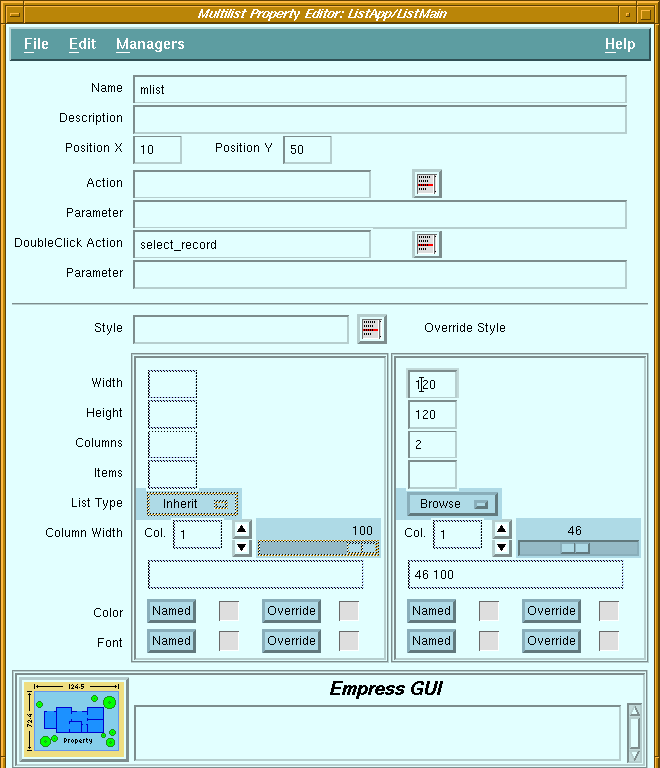 Figure 5-11 Multilist Property Editor
Purpose
A multilist consists of multiple synchronized lists controlled by one vertical scroll bar. For example, the Application Name and Description lists in the Application Manager screen are part of the same multilist.
As a selection is made from one of the columns of the multilist, the corresponding row in the other columns is also chosen. Each column may have a horizontal scroll bar for individual scrolling of the text in the list items. The selection policy of a multilist (list type) determines how items are selected and de-selected with the mouse button.
Screen Elements
| Name | The name is needed for the application to set the items of a multilist, and to get the selected item(s). |
| Description | Descriptive comment for the multilist. |
| Position X | Distance from left edge of window. |
| Position Y | Distance from top edge of window. |
| Action | Name of the action associated with a single-click of the mouse on an item. |
| Action button | Displays a list of available actions. |
| Parameter | Optional constant string passed as argument to the action. |
| DoubleClick Action | Name of the action associated with a double-click of the mouse on an item. |
| DoubleClick Action button | Displays a list of available actions. |
| Parameter | Optional constant string passed as argument to the double-click action. |
| Columns | Number of columns in the multilist. | |
| Items | Number of visible items (alternative to Height in pixels). If a non-null value is specified, Height will automatically be set to null. The actual height of the list will depend on the font used. | |
| List Type: | Specifies the selection policy for the multilist. | |
| Single | Allows zero or one selected item. Clicking on an item toggles its selection state (i.e., if it was selected, it becomes unselected, and vice versa), and de-selects any other selected item. | |
| Browse | Allows only one selected item. Clicking on an item selects it, and de-selects any other item. Unlike the Single policy, if the item was selected, it will not be de-selected. | |
| Multiple | Allows any number of selected items. Clicking on an item toggles its selection state, but does not affect the state of other items. | |
| Extended | Allows any number of selected items in a contiguous range. Clicking and dragging the mouse pointer on a range of items causes the items in the range to be selected, and de-selects any other item. | |
| Column Width | The width of the columns in a multilist are specified in relative terms
(percentage), not in absolute dimensions. The field next to the Col. label
indicates the column whose width is to be adjusted by the scale. The column
number is changed by clicking on the arrow buttons. (Note: the leftmost
column is column number 1). The percentage values set for all the columns
are displayed in the field below the scale.
The values indicate the distance between the left side of the multilist and the right side of the column specified, as a percentage of the total width of the multilist. For example, a multilist with 4 columns of equal width would have Column Width set to "25 50 75 100". The value for the last column is usually 100, otherwise there will be a space between the last column and the right side of the multilist. |
|
5.16 Option Menu Property Editor
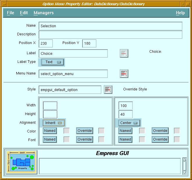 Figure 5-12 Option Menu Property Editor
Purpose
The purpose of the option menu button is to allow the user to select one (and only one) from a fixed list of choices. An option menu button looks like a push button with a rectangular indicator on the right. When the button is pushed, a list of choices appears. When one of the items is selected, the label of the selected item appears on the option menu button.
The list of choices which appears when clicking the button is in fact an option menu bin which is associated to the button. Each option menu bin must only be associated with a single option button.
Screen Elements
| Name | The name is needed for the application to read or change the setting of the option menu button. |
| Description | Descriptive comment for the option menu button. |
| Position X | Distance from left edge of window. |
| Position Y | Distance from top edge of window. |
| Label | Text or name of pixmap to be displayed on the left of the button. |
| Label Type | Specifies whether label is text or pixmap. |
| Label list button | Displays a list of pixmaps available. |
| Label display | Displays the text or pixmap selected. |
| Menu Name | Name of option menu bin to be displayed when the button is clicked. |
| Menu list button | This button will pop-up a list of available option menu bins. |
| Alignment | Label text may be aligned left, right or centered. |
5.17 Push Button Property Editor
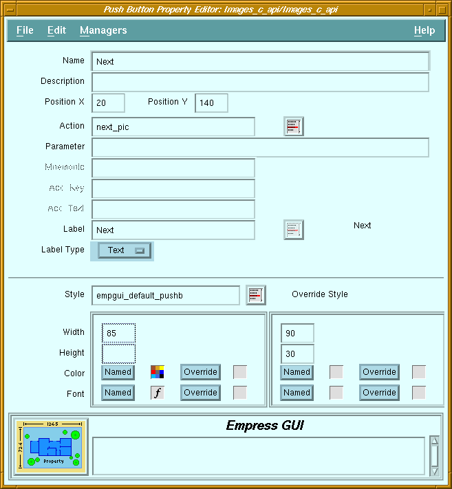 Figure 5-13 Push Button Property Editor
Purpose
A push button is a button with a text label or an identifying icon on it. When a push button is clicked on, the action attached to the button is invoked. Push buttons can be placed in windows or in menus. In windows, they usually have a three-dimensional look, but in menus, they are mostly flat.
Screen Elements
| Name | Not usually required for push buttons, unless it is part of an option menu. |
| Description | Descriptive comment for the push button. |
| Position X | Distance from left edge of window. |
| Position Y | Distance from top edge of window. |
| Action | Name of the action to be invoked whenever the button is pushed. |
| Action list button | Displays a list of available actions. |
| Parameter | Optional constant string passed as argument to the action. |
| Mnemonic | Mnemonic letter which can be used to activate the button when the menu is visible. |
| Accelerator Key | Key combination which can be used to activate the button even when the menu is not visible. |
| Accelerator Text | Text displayed on the button (next to the label) to indicate the key combination required for the accelerator key. |
| Label | Text or name of pixmap to display on button. |
| Label Type | Specifies whether label is text or pixmap. |
| Label list button | Displays a list of pixmaps available. |
| Label display | Displays the text or pixmap selected. |
5.18 Radio Box Property Editor
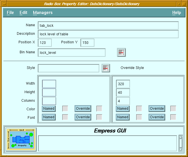 Figure 5-14 Radio Box Property Editor
Purpose
The purpose of the radio box is the same as that of the option menu: to allow the user to select one (and only one) from a fixed list of choices. The difference is that the radio box always shows all the available choices, whereas the option menu button only shows the selected choice.
The radio box is a rectangular area in a window which acts as a placeholder for the contents of a radio box bin. The latter contains a set of toggle buttons, only one of which is "on" at any time. When used in a radio box, these toggles have diamond-shaped indicators, and are usually called radio buttons. These buttons can be arranged in the radio box as a one- or two-dimensional array.
Screen Elements
| Name | The name is needed for the application to read or change the setting of the radio box. |
| Description | Descriptive comment for the radio box. |
| Position X | Distance from left edge of window. |
| Position Y | Distance from top edge of window. |
| Bin Name | Name of radio box bin containing the toggle buttons to be displayed in the radio box. |
| Bin list button | Displays a list of radio box bins. When one of the bins in the list is selected, its name is copied to the Bin Name field. |
| Columns | Arrange the buttons in the specified number of columns. The number of rows will depend on the total number of buttons. |
5.19 Scale Property Editor
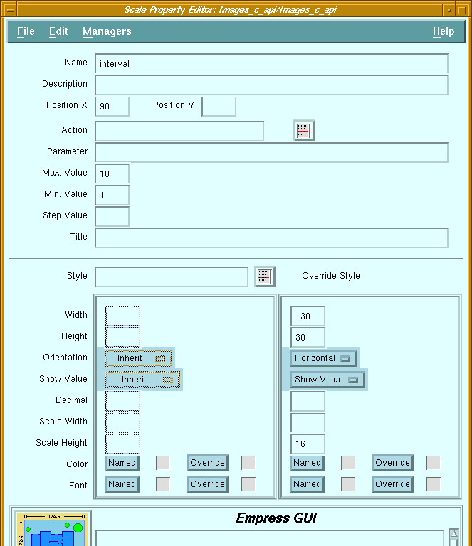 Figure 5-15 Scale Property Editor
Purpose
A scale consists of a horizontal or vertical bar with a slider mechanism which can be moved to indicate a numeric value. Although the value may be displayed as a decimal number, internally the value of a slider is always an integer number.
For example, a scale may be defined with a minimum of -100, a maximum of 200, a step size of 5, and decimal set to 2. It will be displayed with values ranging from -1.00 to 2.00, and the slider can be set at increments of 0.05 (i.e., -1.00, -0.95 ... 1.90, 1.95, 2.00). If the scale is set to 1.15, the value obtained from the scale by a program will be 115. The decimal setting is ignored when a program assigns or reads the value.
Screen Elements
| Name | The name is needed for the application to read and change the value of a scale. |
| Description | Descriptive comment for the scale. |
| Position X | Distance from left edge of window. |
| Position Y | Distance from top edge of window. |
| Action | Name of the action to be invoked whenever the scale is used. |
| Action list button | Displays a list of available actions. |
| Parameter | Optional constant string passed as argument to the action. |
| Max. Value | An integer value specifying the upper limit. Default value is 100. |
| Min. Value | An integer value specifying the lower limit. Default value is 0. |
| Step Value | A positive integer specifying the increment size. Default value is 1. |
| Title | Text label displayed next to the slider bar. |
| Orientation: | ||
| Horizontal | The slider bar is horizontal, with the minimum on the left and the maximum on the right end of the bar. The title is placed under the left end of the bar. The value is displayed above the slider. | |
| Vertical | The slider bar is vertical, with the minimum at the bottom and the maximum at the top of the bar. The title is placed to the right of the top end of the bar. The value is displayed to the left of the slider. | |
| Show Value | Controls whether the value of the current setting should be displayed. | |
| Decimal | Number of decimal places to use for displaying the value. | |
| Scale Width | Width of slider bar in pixels. If null, the width of the bar will be the same as the "Width" of the whole scale (if horizontal), or it will be default to 20 pixels (if vertical). | |
| Scale Height | Height of slider bar in pixels. If null, the height of the bar will
be the same as the "Height" of the whole scale (if vertical),
or it will default to 20 pixels (if horizontal).
(Width and Height specify the total area of the component, whereas Scale Width and Scale Height specify the size of the slider bar itself.) |
|
5.20 Separator Property Editor
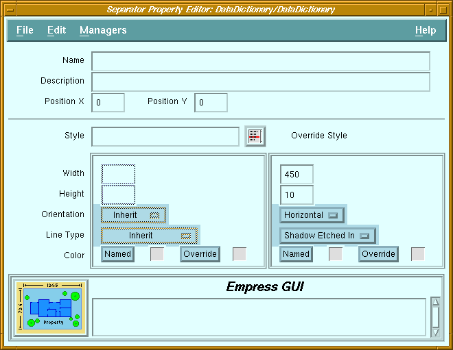 Figure 5-16 Separator Property Editor
Purpose
A separator is a horizontal or vertical line used to visually separate items in a window or a menu. It may be one of several types of lines, including single, double, dashed, or "shadow etched in" lines.
Screen Elements
| Name | Not required for separators. |
| Description | Descriptive comment for the separator. |
| Position X | Distance from left edge of window. |
| Position Y | Distance from top edge of window. |
| Orientation | Separators may be oriented vertically or horizontally. | |
| Line Type: | ||
| Single Line | A single solid line is drawn centered in the separator area. | |
| Double Line | A double solid line is drawn centered in the separator area. | |
| Single Dash | A single dashed line is drawn centered in the separator area. | |
| Double Dash | A double dashed line is drawn centered in the separator area. | |
| No Line | No line is drawn. This is only useful if the separator has a background color different from that of the window or menu. | |
| Shadow Etched In | A line with shadows (to impart a 3-dimensional look) is drawn centered in the separator area. | |
5.21 Toggle Button Property Editor
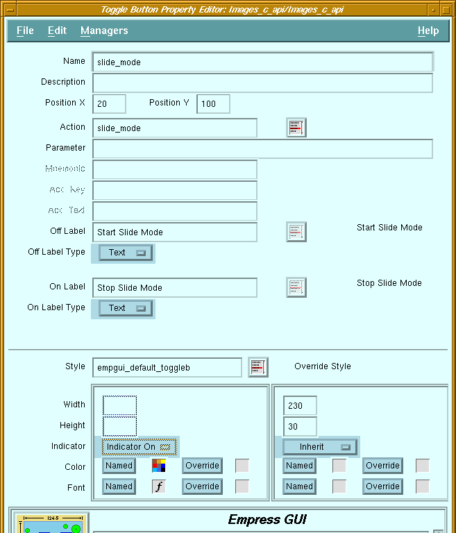 Figure 5-17 Toggle Button Property Editor
Purpose
A toggle button has two states: "on" and "off". It may have an indicator to indicate its state. Also, each state may have a different text or pixmap label displayed on the button. The indicator is "in" for the "on" state, and "out" for the "off" state. Toggle buttons which are not in a radio box are also called check boxes. They have rectangular indicators, and are independent of each other.
Toggle buttons which are in a radio box are called radio buttons. They have diamond-shaped indicators, and only one of them can be "on" at any time.
Screen Elements
| Name | The name is needed for the application to read or set the state of the toggle button. |
| Description | Descriptive comment for the button. |
| Position X | Distance from left edge of window. |
| Position Y | Distance from top edge of window. |
| Action | Name of the action to be invoked whenever the toggle changes state. |
| Action list button | Displays a list of available actions. |
| Parameter | Optional constant string passed as argument to the action. |
| Mnemonic | Mnemonic letter which can be used to activate the button when the menu is visible. |
| Accelerator Key | Key combination which can be used to activate the button even when the menu is not visible. |
| Accelerator Text | Text displayed on the button (next to the label) to indicate the key combination required for the accelerator key. |
| Off Label | Text or name of pixmap to be displayed on the button when it is "off". |
| Off Label Type | Specifies whether off label is text or pixmap. |
| Off Label button | Displays a list of pixmaps available. |
| Off Label display | Displays the text or pixmap selected for off label. |
| On Label | Text or name of pixmap to be displayed on the button when it is "on". |
| On Label Type | Specifies whether on label is text or pixmap. |
| On Label button | Displays a list of pixmaps available. |
| On Label display | Displays the text or pixmap selected for on label. |
| Indicator | Specifies whether the indicator should be displayed. If the labels for the "on" and "off" states are the same, then the indicator is needed to provide visual feedback to the user. |
5.22 User-Defined Object Property Editor
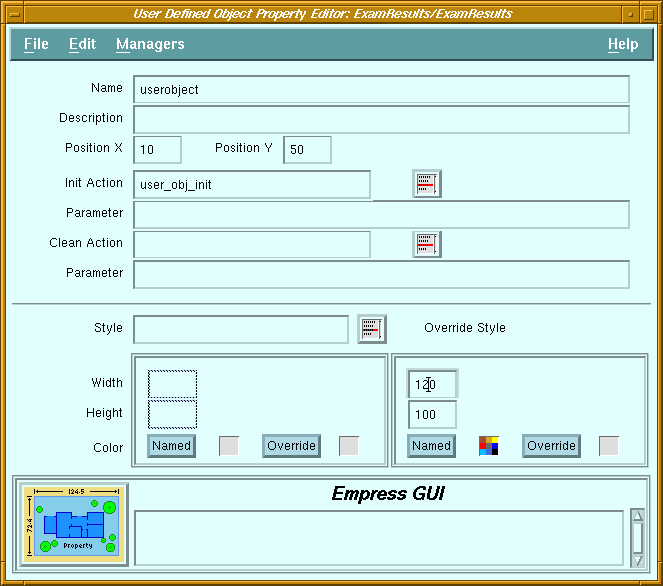 Figure 5-18 User-Defined Object Property Editor
Purpose
A user-defined object is a Motif Drawing Area widget which can be controlled by callback routines defined by the developer using the C API. The callback routines can use the widget as a drawing canvas, or as a manager for other widgets, etc. The name does not imply that the end-user can necessarily create drawings with the mouse, as in a "paint" program (unless the callback routines allow such interaction).
It is intended for use by developers who are familiar with Motif programming, and it is not accessible in the script language.
Screen Elements
| Name | The name can be used by the application to get the widget. |
| Description | Descriptive comment for the object. |
| Position X | Distance from left edge of window. |
| Position Y | Distance from top edge of window. |
| Init Action | Name of action to be invoked when the widget is created. |
| Init Action button | Displays a list of available actions. |
| Parameter | Optional constant string passed as argument to the init action. |
| Clean Action | Name of action to be invoked when the widget is destroyed. |
| Clean Action button | Displays a list of available actions. |
| Parameter | Optional constant string passed as argument to the clean action. |