6.2 Font Style Editor
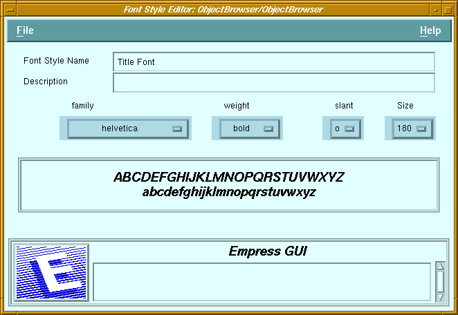 Figure 6-2 Font Style Editor
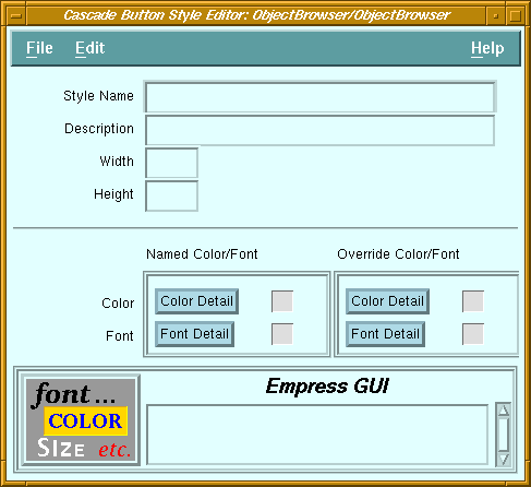
Purpose
There are a number of style editors, one for each type of style, but they are similar to each other, and to the style portion of the component editors for the corresponding components. Therefore, a generic description is provided to cover them all. (For details of a particular style editor's options, see the corresponding component editor description.)
The style editors for color and font are quite different from the other editors since they do not relate directly to components, and as such, they do not have properties such as width or height. Instead, color and font styles are often used as part of specific component styles. For example, a color style may be used by a label style, push button style, option menu style, etc. to avoid specifying the individual colors in the definition of each of these component styles.
Called From
Menu Bar Options
| File | ||
| Run | Run the current application. | |
| Run with parameters | Run the application, with parameters obtained from a dialog box. | |
| Save | Save the changes to the database. | |
| Save & Exit | Save the changes and return to the Style Manager screen. | |
| Exit | Return to the Style Manager screen. | |
| Edit | ||
| Clear All Fields | Clears the fields on the top half of the screen. | |
| Reset All Fields | Reset the fields on the top half of the screen to saved values. | |
| Clear Override Font | Clear the font settings in the Override Style section. | |
| Clear Override Color | Clear the color settings in the Override Style section. | |
| Style Name | Name of the style. | |
| Description | Descriptive comment for the style. | |
| Width | Width of the object (in pixels). | |
| Height | Height of the object (in pixels). | |
| Color: | ||
| Named | Invoke the Object Color Detail screen to allow a named color style to be selected. If a named color style has been selected, the icon next to the button is a colored check board. Otherwise, the icon is blank. | |
| Override | Invoke the Object Override Color Detail screen to allow specific colors to be selected. If override colors have been selected, the icon next to the button is a colored check board. Otherwise, the icon is blank. | |
| Font: | ||
| Named | Invoke the Object Font Detail screen to allow a named font style to be selected. If a named font style has been selected, the icon next to the button is an italic " f ". Otherwise, the icon is blank. | |
| Override | Invoke the Object Override Font Detail screen to allow a specific font to be selected. If an override font has been selected, the icon next to the button is an italic " f ". Otherwise, the icon is blank. | |
| Audio Field: | ||
| Autoplay Option | Determines if playback should start automatically when data is assigned to the audio field, or only when the Play button is pressed (default). | |
| Field: | ||
| Rows | Height of field in terms of rows (lines) of text. | |
| Columns | Width of field in terms of characters. | |
| Editor type | The field can allow single line editing or multiple lines with/without word-wrapping. | |
| Scrollable | Specifies whether the field should have scroll bars. | |
| Editable | Specifies whether the user can edit data in the field. | |
| Label: | ||
| Alignment | Label text or pixmap can be aligned left, right or centered. | |
| List: | ||
| Items | Number of visible items (alternative to Height in pixels). | |
| List Type | Selection policy for the list: Single, Browse, Multiple, Extended. | |
| Scrollable | Specifies whether scroll bars are always displayed (constant) or appear only when needed (dynamic). | |
| Multilist: | ||
| Columns | Number of columns in the multilist. | |
| Items | Number of visible items (alternative to Height in pixels). | |
| List Type | Selection policy for the list: Single, Browse, Multiple, Extended. | |
| Column Width | Widths of the columns in multilist, specified in percentage of overall width of multilist. | |
| Option Menu: | ||
| Alignment | Label text on button may be aligned left, right or centered. | |
| Radio Box: | ||
| Columns | Arrange the buttons in the specified number of columns. | |
| Scale: | ||
| Orientation | The slider bar can be horizontal or vertical. | |
| Decimal | Number of decimal places to use for displaying the value. | |
| Scale Width | Width of slider bar in pixels. | |
| Scale Height | Height of slider bar in pixels. | |
| Show Value | Controls whether the value of the current setting should be displayed. | |
| Separator: | ||
| Orientation | Separators may be vertical or horizontal. | |
| Line Type | The separator may have a single or double, solid or dashed line, etched line, or no line. | |
| Toggle Button: | ||
| Indicator | Specifies whether the indicator should be displayed. | |
| Window: | ||
| Frame | Specifies whether the window should have a thin frame around it. | |
| Scrollable | Specifies whether the window should have vertical and horizontal scroll bars. | |
| Comp Color | Default color for components in this window | |
6.2 Font Style Editor
Figure 6-2 Font Style Editor
Purpose
A font consists of four parts: family, weight, slant, and size. A font style can specify all four parts, or some parts can be left unspecified (by selecting the "*" from the corresponding option button). In the latter case, when a component using the style is displayed, the unspecified part of the font will be inherited.
If the font specified by the style is not available on the X-server, the default font for the X-server will be used.
Called From
Menu Options
| File | ||
| Run | Run the current application. | |
| Run with parameters | Run the application, with parameters obtained from a dialog box. | |
| Save | Save the changes to the database. | |
| Save & Exit | Save the changes and return to the Style Manager screen. | |
| Exit | Return to the Style Manager screen. | |
| Font Style Name | Name of the font style (editable for new styles only). |
| Description | Descriptive comment on the font style. |
| Family | Option button offering a choice of font family (Courier, Helvetica, etc.). |
| Weight | Option button offering a choice of weights (medium, demi-bold, bold). |
| Slant | Option button offering a choice of slants (Roman, Italic, Oblique). |
| Size | Option button offering a choice of sizes (in tenths of a point). |
| Sample display area | Sample of current font selection (in upper- and lowercase). |
| Message field | See Chapter 2 - "Common Elements of Empress GUI Builder Screens". |
6.3 Object Font Detail
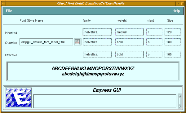
Figure 6-3 Object Font Detail
Purpose
The Object Font Detail screen can be accessed in several ways. It may be accessed from a style editor, by clicking on the Font Detail button in the Named Font section. In this case, the "Inherited" font characteristics will be blank, since the style is not associated with a particular object.
The Object Font Detail screen may also be Called From an object's property editor, by clicking on either the Named Font or Override Font button in the Named Style section, or by clicking on the Named Font in the Override Style section of the property editor. In the first two cases, the set of font characteristics (family, weight, slant and size) defined in the named style can be displayed, but not changed. In the last case (Named Font button in Override Style section), a named font style can selected.
Called From
Menu Options
| File | ||
| Set | Apply changes | |
| Set & Exit | Apply changes and return to the previous screen | |
| Exit | Return to the previous screen | |
| Inherited | Displays the font characteristics (family, weight, slant and size) that are inherited from the parent window (or from the Motif defaults). |
| Override | Displays the name of the selected font style, as well as the parts (family, weight, slant and size) defined in that style. |
| Font List button | The button next to the font style name displays a list of available font styles and allows a style to be selected. This button may be insensitive. |
| Effective | Displays the font characteristics resulting from the inherited and override characteristics. |
| Sample display area | Sample of effective font selection (in upper- and lowercase). |
| Message field | See Chapter 2 - "Common Elements of Empress GUI Builder Screens". |
6.4 Object Override Font Detail
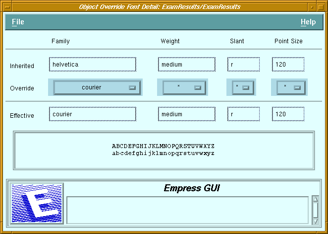 Figure 6-4 Object Override Font Detail
Purpose
The Object Override Font Detail screen can be accessed in two ways. It may be Called From an object's property editor, by clicking on the Override Font button in the Override Style section. It may also be accessed from a style editor, by clicking on the Font Detail button in the Override Font section. In this case, the "Inherited" font characteristics will be blank.
Called From
Menu Options
| File | ||
| Set | Apply changes | |
| Set & Exit | Apply changes and return to the previous screen | |
| Exit | Return to the previous screen | |
| Inherited | Displays the font characteristics (family, weight, slant and size) that are inherited from the parent window (or from the Motif defaults). |
| Override | Four option menu buttons allow the various parts (family, weight, slant and size) of a font to be selected. To pass on the inherited value for a part, "*" should be specified. |
| Effective | Displays the font characteristics resulting from the inherited and override characteristics. |
| Sample display area | Sample of effective font selection (in upper- and lowercase). |
| Message field | See Chapter 2 - "Common Elements of Empress GUI Builder Screens". |
6.5 Color Style Editor
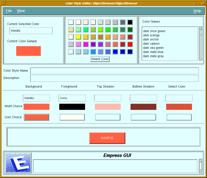 Figure 6-5 Color Style Editor
Purpose
A color style consists of up to 5 separate colors: Background, Foreground, Top Shadow, Bottom Shadow, and Select colors. The Background color is the most important one. Motif will automatically calculate the other colors, given a Background color. It is usually advisable to use the Motif-selected colors for Top Shadow, Bottom Shadow, and Select colors, but the Color Property Editor allows the user to override these selections.
Not all components use all five color parts. Labels, for example, do not have top and bottom shadows or a select color.
Called From
Menu Options
| File | ||
| Run | Run the current application. | |
| Run with parameters | Run the application, with parameters obtained from a dialog box. | |
| Save | Save the changes to the database. | |
| Save & Exit | Save the changes and return to the Style Manager screen. | |
| Exit | Return to the Style Manager screen. | |
| View | ||
| Clear Filters | Show all color names in list | |
| Set Filters | Apply selection criteria to list of color names. | |
| Current Selected Color | Name of the color selected from the palette or the color list. |
| Current Color Sample | A sample of the selected color. |
| Color Palette | A set of colored push buttons. Clicking on a button will select the corresponding color. |
| Inherit Color button | Clicking on this button will set the selected color to null. Assigning a null color to any of the color parts implies that the Motif-selected color will be used. |
| Color list | A scrollable list of names of colors available on the X-server. Colors may be selected by clicking on one of the names in the list. |
| Color Style Name | The name of the color style can be edited only if it is a new style. |
| Description | Descriptive comment on the style. |
| Motif Choice | The five colors displayed are those selected by Motif, based on the Background color. |
| User Choice | The user can select colors from the palette or the color list and apply them to the color parts by clicking on the corresponding button (Background, Foreground, Top Shadow, Bottom Shadow, and Select Color). |
| Sample display area | A sample of the current color selection is displayed, using a push button as example. |
| Message field | See Chapter 2 - "Common Elements of Empress GUI Builder Screens". |
6.6 Object Color Detail
 Figure 6-6 Object Color Detail
Purpose
The Object Color Detail screen can be accessed in several ways. It may be accessed from a style editor, by clicking on the Color Detail button in the Named Color section. In this case, the "Inherited" colors will be blank, since the style is not associated with a particular object.
It may also be Called From an object's property editor, by clicking on either the Named Color or Override Color button in the Named Style section, or by clicking on the Named Color in the Override Style section of the property editor. In the first two cases, the set of font characteristics (family, weight, slant and size) defined in the named style can be displayed, but not changed. In the last case (Named Font button in Override Style section), a named font style can selected.
Called From
Menu Options
| File | ||
| Set | Apply changes | |
| Set & Exit | Apply changes and return to the previous screen | |
| Exit | Return to the previous screen | |
| Inherited | Displays the colors (background, foreground, top & bottom shadow and select) that are inherited from the parent window (or from the Motif defaults). |
| Override | Displays the name of the selected color style, as well as the colors defined in that style. |
| Color List button | The button next to the color style name displays a list of available color styles and allows a style to be selected. This button may be insensitive. |
| Effective | Displays the colors resulting from the inherited and override colors. |
| Sample display area | A sample of the current color selection is displayed, using a push button as example. |
| Message field | See Chapter 2 - "Common Elements of Empress GUI Builder Screens". |
6.7 Object Override Color Detail
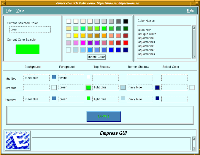 Figure 6-7 Object Override Color Detail
Purpose
The Object Override Color Detail screen can be accessed in two ways. It may be Called From an object's property editor, by clicking on the Override Color button in the Override Style section. It may also be accessed from a Style Editor, by clicking on the Color Detail button in the Override Color section. In this case, the "Inherited" colors will be blank.
Called From
Menu Options
| File | ||
| Set | Apply changes | |
| Set & Exit | Apply changes and return to the previous screen | |
| Exit | Return to the previous screen | |
| View | ||
| Clear Filters | Show all color names in list | |
| Set Filters | Apply selection criteria to list of color names. | |
| Current Selected Color | Name of the color selected from the palette or the color list. |
| Current Color Sample | A sample of the selected color. |
| Color Palette | A set of colored push buttons. Clicking on a button will select the corresponding color. |
| Inherit Color button | Clicking on this button will set the selected color to null. Assigning a null color to any of the color parts implies that the Motif-selected color will be used. |
| Color List | A scrollable list of names of colors available on the X-server. Colors may be selected by clicking on one of the names in the list. |
| Inherited | Displays the colors (background, foreground, top & bottom shadow and select) that are inherited from the parent window (or from the Motif defaults). |
| Override | The current selected color can be applied to any of the five color parts by clicking on the corresponding push button. The name of the select color will be displayed in the field next to the push button. |
| Effective | Displays the colors resulting from the inherited and override colors. |
| Sample display area | A sample of the current color selection is displayed, using a push button as example. |
| Message field | See Chapter 2 - "Common Elements of Empress GUI Builder Screens". |
6.8 Default Style Setup
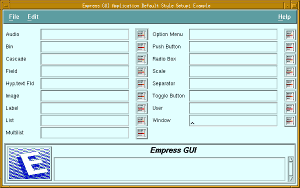
Figure 6-8 Default Style Setup
Purpose
Each type of component can have many styles defined for it. The default style specified for a component will automatically be used when a component of that type is placed in a window or bin.
The list of styles available in the shareable modules of the current application for each object can be displayed by selecting the icon to the right of the corresponding field. A style can be picked from the list, to become the default for that type of object. A single default can be removed by clearing the value from the field. The entire set of defaults can be cleared by selecting Edit, Clear.
Called From
Menu Options
| File | ||
| Set | Apply changes | |
| Set & Exit | Apply changes and return to the previous screen | |
| Exit | Return to the previous screen | |
| Edit | ||
| Clear | Clear all fields | |
| Reset | Reset all fields to their original values | |
| Default Style fields | (One for each type of component).
The name of the default style for each component type is displayed. |
| List button | Clicking on one of the list buttons will display a list of available styles for the corresponding type. To select a style in the list, double-click on the style name. |
| Message field | See Chapter 2 - "Common Elements of Empress GUI Builder Screens". |