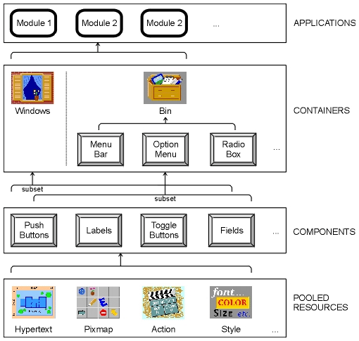
Figure 3-1 Empress GUI Builder elements
Empress GUI Builder extends the facilities provided by Motif, combining some of the basic elements into more powerful objects. It allows you to build applications by building up the individual objects within the application: windows can be built through point-and-click interaction with the toolbar components, actions can be written for the application to execute, styles can be set up for objects so that the application has a consistent look and feel.
Within Empress all parts of the application are objects. The application itself is an object which is made up of modules (objects) which may be linked in a shareable or non-shareable manner. Modules contain many types of objects: windows, menu bars, push buttons, and labels to name a few. Styles (of color, font, size, etc.) are objects which can be applied to classes of objects or to individual objects as pooled resources. Styles can also be inherited from parent objects. See diagram below:
Figure 3-1 Empress GUI Builder elements
Useful applications require more than just displays. They may need, for example, to interact with databases to do work on the information stored. Empress GUI Builder gives you access to Empress and other database managers for application data storage and manipulation. The application may also run any scripts, executables or system commands you require.
A visual editor permits you to position objects in windows, and attach actions to them at various points. For example, a field object might have both an entry and an exit action. The entry action might place a default value in the field, while the exit action might update a database table.
Actions may be routines written in C or C++ or they may be scripts written in the Empress GUI Builder Script Language.
An action has a unique name and is invoked by referencing its name in a place where the action is expected. For example:
open table employees read;
declare c1 cursor for select from employees;
open c1;
fetch next from c1;
let win1"@name" = employees."name";
3.1.2 Pixmaps
Pixmaps are (usually small) areas of memory containing icons for display.
They may be used to decorate push buttons, such as the EXIT button,
for logos, labels, or other purposes. They may be in color. The term is
also used to refer to the individual images.
Pixmaps are stored in modules. The name of the pixmap is attached to each object within the application which uses that pixmap. For example, a pixmap called company_logo may appear in a label field in the bottom left corner of each screen of the application. Each label will refer to the same pixmap, which is stored once.
Pixmaps can be generated using utilities available in most X installations. They can also be converted from other sources, such as GIF images. (See The Portable Bitmap Toolkit section in the X System Users Guide by OReilly & Associates, Inc.).
Figure 3-2 Example of a pixmap
3.1.3 Hypertext
Hypertext is a way of presenting information that allows you to browse
and search it in a non-linear fashion. Significant terms, usually identified
by a distinctive font or color, may be expanded by selecting them with
a mouse click or other action. This means that from a general text you
can pursue specific details of a topic to whatever depth your interest
or the available material permits.
Online help for computer applications is an ideal use for hypertext. If you need only a brief description of a topic, you can be shown an outline. If you want more detailed explanation, you can select the item you want expanded. Within Empress all hypertext help pages are stored in a hypertext pool. Each page has a name which uniquely identifies it. Hypertext help pages are displayed by the Empress hypertext object.
Empress uses a subset of HTML (Hypertext Markup Language), as supported by World Wide Web as its hypertext syntax. In Empress hypertext, HTML tags are embedded in plain ASCII text as formatting directives. For example, the tags <B> and </B> surrounding some text turn bold printing on at the start of the text, and off again after it.
Empress also supports links. These are keywords in one
hypertext screen, which when clicked by the user, bring up additional help.
The additional help may be text found further on in the original help screen
or may be in another document altogether. The Empress hypertext object
will interpret and format the data and implement the links automatically.
3.1.4 Styles
Every object in Empress GUI Builder has certain attributes
known as properties. These properties can include location, name, color,
font, size, and sensitivity. Some of these properties must be unique, such
as name and location. Others, particularly color, font, and size, may be
shared by many items.
Combinations of properties (such as color, font, and size) used for particular types or groups of components are called styles. Styles can be given names, and therefore shared by many objects.
Empress provides a set of default styles in the Public Module. Therefore, you do not need to define any styles unless you wish to change them.
You can also define your own set of default styles for different components in a window which will be applied to all components of that type within the application. Windows have three styles associated with them; color and font for themselves and color for the components (fields, labels, buttons, etc.) within them.
If you define styles for classes of objects, (e.g., buttons) you will not have to define styles for individual members of the class, except for the ones you want to override. This saves time and makes it easy to modify all the entities having a common style with a single change.
For example, you could define the size and color of all push buttons to be the same, except for EXIT buttons. You could do this by defining one style called button and another exit_button then specifying the type (button or exit_button) for each button you defined. If the color-scheme changed, you could modify all the buttons in the application very easily.
Styles are associated with each type of component (e.g., there can be one or more audio field styles, one or more cascade button styles, and so on). These can point to defined color and font styles.
The components within the Empress toolkit are:
|
|
For example, no two labels in a window will normally have the same X
and Y coordinates.
For example, all toggle buttons in an application will normally have the same color, font, size and may have the indicator on.
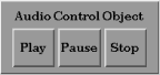
Audio data may be received and/or manipulated by the application and sent to the Empress GUI Builder audio controller for playing. Currently, Empress supports only the AIFF and AU sound formats only. Other audio formats will be supported in the future.
Currently, audio data can be stored in an Empress RDBMS in a bulk attribute.
Using the Script API the value of the audio attribute can simply be assigned to the audio controller for playing.
The audio controller has three push buttons to control sounds:
| Play | Start or resume playing the sound. |
| Pause | Suspend playing until re-started. |
| Stop | End playing. |
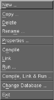
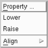
Cascade buttons are a special kind of button used to display pull-down menus, for choices within choices. They may occur in a menu bar, a pull-down menu pane, or the label of an option menu.
Cascade buttons can call other cascade buttons, to create multiple levels
of menus.
3.2.2.1 Individual Properties
Standard.
3.2.2.2 Common Properties/Style
Standard.
3.2.3 Field
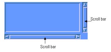
Figure 3-5
A field is used for display or input of text including numbers or characters.
Fields may be defined to be single or multiple lines (with or without word-wrap), and may be editable or for display only.
Entry and exit actions can be associated with fields, as can range checks.
Scroll bars can be attached to fields. Scroll bars can be vertical, horizontal, or both. Scroll bars can be fixed, (i.e., they are always visible) or they can be dynamic (i.e., they appear only when the text string goes beyond the field area).
| Enter Action | |
| Exit Action | |
| Field Type | valid data type, used by Script API |
| Field Range | range of valid values, used by Script API |
| Number of rows
and columns |
(alternative to pixel width and height) |
| Editor type | (single line, multi-line, or word-wrapped) |
| Scrollable | (whether scroll bars should be provided) |
| Editable | (i.e., entry or display-only) |
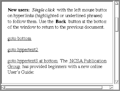
This is a field for displaying cross-referenced textual information. It supports different fonts, and bulleted, numbered and description lists. Color-coded link words can be set up which, when clicked on, can bring up other hypertext screens. The Empress hypertext language is a subset of HTML (Hypertext Markup Language) which is supported by the World Wide Web.
The text to be displayed is determined by an action making a call containing
the name of the help document.
3.2.4.1 Individual Properties
| Action and Parameter | The action can receive the name of the hypertext document as a parameter. |
| Select list | A push button which provides a pick list of all actions within the application. |
Currently, image data can be stored in an Empress RDBMS in a bulk attribute.
Using the Script API the value of the image attribute can simply be assigned to the image field for display. Images which are too large for the image field will get clipped. Large images can be placed into very large image fields and displayed inside smaller windows.
Scroll bars attached to the window will allow scrolling of the images.
Scroll bars are not attached to image fields.
3.2.5.1 Individual Properties
Standard.
3.2.5.2 Common Properties/Style
Image fields do not have an associated font style.
3.2.6 Label
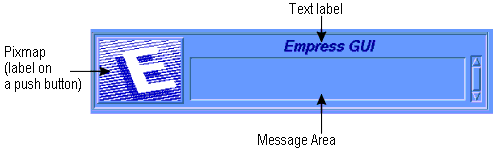
Figure 3-7
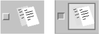
Labels are display areas on the screen which have text or a pixmap associated
with them. They may be used for titles, captions, logos, identifying buttons,
or any other purpose needing a fixed appearance.
3.2.6.1 Individual Properties
| Alignment | May be Left, Right, or Center. |
| Label type | Pixmap or text |
A list is a variable-length array of selectable items. When an item is selected, it is highlighted.
You can have four types of selections from lists:
Vertical scroll bars move the visible portion of the list up and down within the viewing area. Horizontal scroll bars move entries too long to display in the available viewing area.
Scroll bars may be constant (always visible), or dynamic (only shown
when needed, i.e., when the data extends beyond the viewing area).
3.2.7.1 Individual Properties
| Action, and its Parameter | The action that is invoked by a single click on an item in the list. By default an item is selected or de-selected (in the case of a Single Select list only) with a single click. |
| Double-click action,
and its Parameter |
The action that is invoked by a double-click on an item in the list. |
| Number of items to display | Alternative to height in pixels |
| List type | Selection policy, one of Single Select, Browse Select, Multiple Select, or Extended Select |
| Scrollable | Constant or dynamic scroll bars |
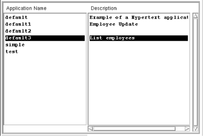
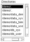
A multilist consists of multiple synchronized lists controlled by one vertical scroll bar. For example, the name and description displays in the Empress manager windows (application, module, window, etc.), as shown above, are multilists. As a selection is made from the multilist all horizontal elements from the other lists are also chosen.
There will be only one vertical scroll bar, because the lists are locked
together. They will all move vertically as one. There may be one horizontal
scroll bar per column for individual scrolling of components.
3.2.8.1 Individual Properties
| Action with Parameter | Invoked by single click |
| Double-click action with Parameter |
| Number of columns to display | |
| Number of items to display | Alternative to height in pixels |
| List type | Selection policy |
| Column Width | Column selector and percentage width scale (resulting arrangements displayed below) |
An option menu looks like a button with an indicator (a small rectangular
box) on the right. If the user clicks on the button, a fixed list (e.g.,
the names of the months) is displayed over the button. When the user chooses
from the pull-down menu, the text image of the selected item appears on
the label beside the indicator.
3.2.9.1 Individual Properties
| Menu name | name of the associated menu |
| Text Alignment | Left, Right, or Center |
A push button is a button with a text label or a pixmap image on it. It has a three-dimensional appearance because of the shadows around it. The color of these shadows is used to give the illusion that the button is raised or depressed.
The size of a push button may be set through a style or can be defined individually.
Clicking on a push button activates it. Push buttons can also be activated by keyboard actions (one or more keys). If the button has focus, (indicated by a shadowed border), it will be activated by hitting <Enter>. From a menu or menu bar, a push button may be activated by accelerator or mnemonic keys, if they have been defined.
If the push button is activated, an action (or set of operations) is
invoked. Push buttons with text labels have a SELECT color associated with
them. The SELECT color is the one which appears briefly when the button
is chosen.
3.2.10.1 Individual Properties
| Action | Invoked when button is pushed |
| Mnemonic | Letter to invoke push button in a menu |
| Accelerator key and text | If button is part of a menu |
A radio box is a place for putting a collection of radio buttons. Each radio button is a particular type of toggle button, which is used for making mutually exclusive choices among all of the radio buttons. Radio buttons have diamond-shaped indicators, to distinguish them from independent toggle buttons, which have square indicators.
A number of radio buttons therefore, only one of which can be selected at a time, will be arranged in a radio box. The radio box component itself is made simply. It calls a radio box bin which is where the radio buttons are created and laid out.
The radio buttons can be arranged in single or multiple columns or rows within a radio box.
Each radio button has an on and an off state, which may be indicated by different on/off text strings or pixmaps.
Also, the indicator diamond itself will show whether the button has been depressed or not.
The radio box appears with all radio buttons off. There can never be
more than one button on; if another button is pressed the previous one
will be turned off before the new one is turned on.
3.2.11.1 Individual Properties
| Bin name | Name of the bin (which contains radio buttons) associated with this box. |
| Columns | Specifies the number of columns to use for arrangement of the push buttons. |

A scale is a slider bar which can chose a numeric value. The scale can be horizontal or vertical. You define the upper and lower end points, the step size, and whether it is in decimal or integer notation. As the user slides the scale, the value may be displayed next to or below the control.
A scale might be used for volume control, for example; two scales might
be used to indicate the upper and lower numeric bounds for a query.
3.2.12.1 Individual Properties
| Action and Parameter | Action that will be called when scale is set, and its needed parameter. |
| Maximum value for control | Maximum value for high-end of scale. |
| Minimum value | Minimum value for low-end of scale. |
| Step value | If scale is clicked on, the increment will change up or down by this amount. |
| Title | Text title which appears under a horizontal scale, or on the right of a vertical scale. |
| Orientation | Vertical or horizontal |
| Show value | Whether or not to display the current value of the scale above for horizontal scales, or on the left for vertical scales. |
| Decimal | Number of decimal places to display |
| Scale width and height | Width and height of the bar itself |
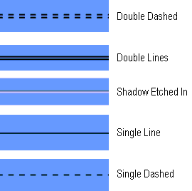
A separator is a line used to separate items. It may be one of several types of line, oriented horizontally or vertically. The separators available are single and double lines, single and double dashed lines and shadow etched in lines.
Separators may be used in a window or in a menu to separate items.
3.2.13.1 Individual Properties
Standard.
3.2.13.2 Common Properties/Style
| Orientation | Horizontal or vertical |
| Line type | One of single line, double line, single dashed, double dashed, shadow etched in, and no line. |
A toggle button is a button with two states: on and off. It looks like a label with an indicator box beside and to the left of it.
The label on the toggle button can be a text string or a pixmap for the "on" state, and a text string or pixmap for the off state.
The indicator box is in to indicate the on position, and out to indicate the off position.
Toggle buttons dealing with independent choices are square, as opposed to radio buttons which are diamond-shaped.
Toggle buttons may have accelerator keys and mnemonics only when they
are in a menu, not when they are in a window.
3.2.14.1 Individual Properties
| Action and Parameter
Off and On Labels |
Each may be text or pixmap |
| Indicator Off/On | Whether the indicator should be displayed. (It is possible that the labels are sufficient to distinguish the states.) |
The C API provides a function which returns the widget ID of the user-defined object. From this point on, it is up to the application programmer to make proper use of the drawing area.
The user-defined object could be used for creating pie charts, histograms, and so on. The appearance and behavior of the object are entirely up to the users program.
Programs making use of this component must be able to interact with Motif. This will generally require that they be written in C.
Initialization and clean-up actions can be associated with user-defined
objects. These are executed before entry to set up callbacks to the widget,
and after exiting.
3.2.15.1 Individual Properties
| Init action and parameter | Initialization action and its parameter. |
| Clean action and parameter | Cleanup action and its parameter. |
|
|
There are seven types of bin:
One bin can activate another bin. For example a menu bar contains one or more cascade buttons each of which calls a pull-down menu. The pull-down menus themselves can contain more cascade buttons which will activate additional pull-down menus. The effect will be a cascading menu.
Because the objects in each bin are separately laid out, you have a
great deal of flexibility and power to design exactly what you want. For
example, a radio box may be laid out with toggle buttons in one column,
or it may have several columns of toggle buttons. Horizontal and/or vertical
separators may be placed in the radio box to more clearly delineate choices
to the user. Menu bars or pull-down menus, for example, may cascade to
whatever level is required.
3.3.2.1 Menu Bar
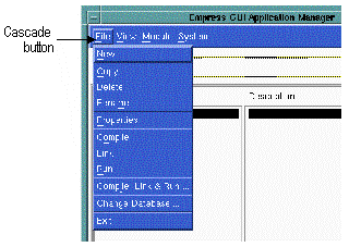
Most modules will have a menu bar, which always appears across the top
of the modules main window (MAINWIN). Obviously, the option entries
in a menu bar should look alike, i.e., have the same style. Most entries
on a menu bar is a cascade button that will invoke a pull-down menu. In
this example, there are five buttons (File, View, etc.),
including the Help.
Figure 3-16
A menu bar choice may lead to a range of options displayed on a menu that temporarily overlays the area below the bar.
The following is a list of components that can be included in a menu bar:
The following is a list of components that can be included in a menu
bar help:
|
|
Pull-down menus arise from clicking on a cascade button, such as those in the menu bar. Pull-down menus may contain single selections (usually implemented as push buttons) or sub-menus (implemented as cascade buttons). Note that deeply nested cascade buttons are discouraged under Motif.
The following is a list components that can be included in a pull-down
menu:
|
|
At most, one pop-up menu is associated with a window. It consists of push and cascade buttons which are grouped together into one menu. Pop-up menus are normally concealed unless you take some action (such as clicking the third mouse button in a particular area). Since they are not visible to the user until invoked, they should be made available in a consistent fashion.
The following is a list of components that can be included in a pop-up
menu:
|
|
A radio box is a collection of radio buttons. It allows a single choice to be selected from a range of options. One, and only one, of the buttons will be selected at any time. They can be all off only when the window is first invoked.
The following is a list of components that can be included in a radio box:
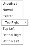
An option menu allows the user to select one choice from a fixed set (such as the days of the week). It displays the current (or default), choice as its label.
When the button is clicked, the options will appear in a list, as in the illustration. If the mouse button is released on a particular choice, the original label changes to reflect the choice. For example, if the choice Top Right were made from the list shown, the resulting button would be:
The following is a list of components that can be included in an option menu:
|
|
Dialog boxes are not definable Empress components in the way that labels or fields are: they are temporary objects, created by an action making a call. They appear in front of the window whose action invoked them, and cannot be iconized independently of the invoking window.
Although they cannot be defined individually, dialog boxes can be given styles. The location of a dialog box can only be specified as one of five positions relative to the calling window; in its center, or in one of its four corners. See below:
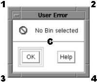
Figure 3-21
See the Empress GUI Builder: Script Language Reference manual for details of the calls to create dialog boxes.
Here is an example of a dialog box:
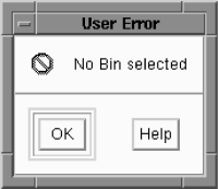
Figure 3-22
Figure 3-23 Empress GUI Builder elements