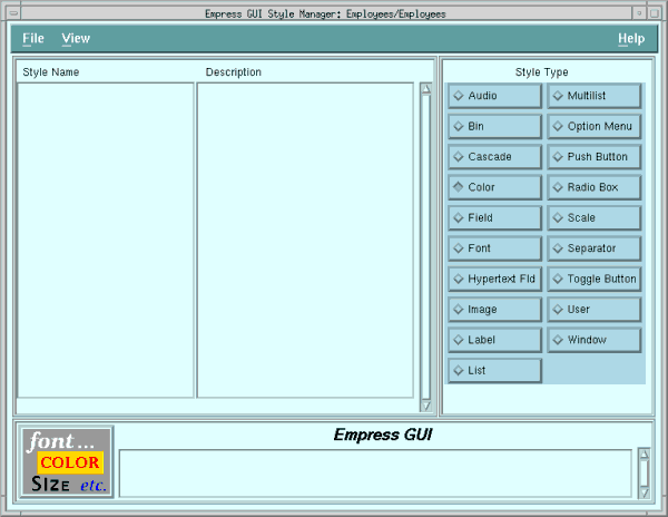
Figure 5-1 Style Manager Box
If you exited completely at the end of the last chapter, do:
empgui emptutdbYou should now be back at the Application Manager, with Employees highlighted.
Highlight employees and then select Tools, Application Module Manager from the menu bar. (Double-clicking on the application will have the same effect.)
Check that Employees is highlighted in the list of module names. From the Application Module Manager menu bar, select Tools, Style. That will take you to the Style Manager.
Nothing will be showing in the style list, because no styles have been defined in the application yet.
For this exercise, we will define color and font styles, which we will use in two other styles we define: one for push buttons, and one for labels. This should be enough to demonstrate the use of styles for more complicated situations.
Figure 5-1 Style Manager Box
You will need to create two color styles and two font styles for this exercise. Start with the color styles. (The Style Type radio button determines which style property editor is invoked.)
5.2 Create Color Styles
Click on the Color button in the Style Type radio box.
Select File, New from the menu bar, to bring up the Color
Property Editor.
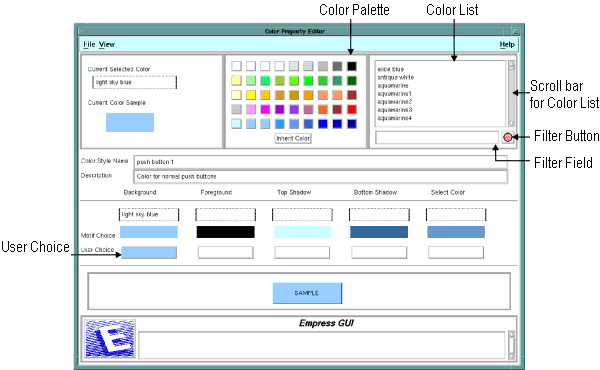
Figure 5-2 Color Property Editor
Pick a color you like from the color palette, by clicking on one of the colored buttons in the color palette at the top of the screen. This will cause the name and a sample of the color to appear in the Current Selected Color window at the top left corner of the editor.
You could also pick a color by clicking on one of the names in the Color List at the top right. You can scroll the color list with the scroll bar on its right, to see the full list.
If you want to try the effect of the filters on lists, key *blue* into the field below the color list, then click on the filter button to the right of it. You should see a list of all the colors with the string blue in their names. To get back to the full list, clear the field to spaces and click the button again.
Once, you have chosen a color, click the User Choice button under the Background column. The color you chose will appear here, and in the Sample button below. Motif will supply suitable colors for the other attributes of a push button: that is, for the foreground color, top and bottom shadow, and select color.
Type a name (e.g., push button 1), into the Color Style Name field, so that you can identify the style when you come to define push buttons.
Save the color style by selecting File, Save & Exit, from the menu bar. Now, create a color style for labels in the same way. Press File, New. Choose a different color for the background. Click on the user choice (Background) field. Then give the style a different name, (say label 1). Press File, Save & Exit.
5.3 Create Font Styles
When you have created the color styles, and are back in the Style Manager,
click on the Font button in the Style Type radio box.
You will see that you have no font styles defined yet. Choose File,
New from the menu bar to create one.
You will want to create two fonts suitable for labelling buttons and fields, a small one and a large one.
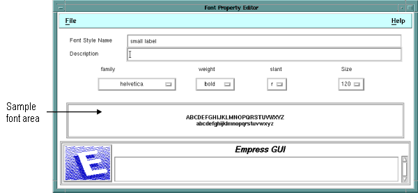
Figure 5-3 Font Property Editor
Type a name (e.g., small label) into the Font Style Name field.
Make a choice from each of the four option menu buttons. You can choose the family, weight, slant and size of the font, by doing the following:
Click on the option button (i.e., family, weight, slant or size), to pull down the menu.
Click on a solid option (the dim choices are not available)
If your choice is valid, it will appear on the button. Go on to the next font characteristic button.
The choice of fonts available to you will depend on your X-server, and will govern which choices in the option menus are active and which are not.
If these are available to you, try Helvetica (family), bold (weight), r for roman (slant), and 120 (point size). The alphabets in the sample font area will display in the chosen font.
Press File, Save & Exit, then repeat the process to create a large label font, say 180 (i.e., 18 point). Save the large font style and exit back to the Style Manager.
So far you have created two color styles and two font styles. Next, you will create two label styles and a push button style, which will make use of the color and font styles you have created.
5.4 Create Label Styles
Select Label in the Style Type radio box, then File,
New. You will see the Label Style Editor.
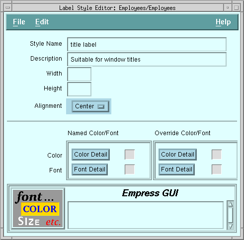
Figure 5-4 Label Style Editor
The first kind of label style you make will be for a title label, suitable for displaying titles in windows.
Enter a name for the style, for example title label. Give it a description, if you wish. Leave the height and width blank. (You will allow the size of the label in the window to set the size, rather than the label style setting a size.)
Click on the Alignment option menu, and choose Center.
Click on the Color Detail button under Named Color/Font. This will bring up the Object Color Detail screen.
5.5 Choosing a Color Style for the Label Style
Click on the list button alongside the Override field. It brings
up a listing of all color styles known to the module you are in. (This
includes color styles defined within the module and color styles defined
in shared modules within the same application. You will recall the PUBLIC
modules that were automatically included when you first built the application.)
You will see lots of empgui_default_color_... styles in the list, which are applied when you make default objects, such as default fields or labels. If you scroll the list, you will also see the two color styles you created.
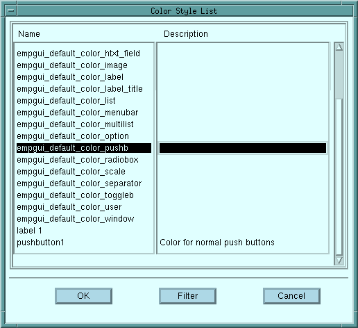
Figure 5-5 Color Style List
Select the label 1 color style.
Click on the OK button, to get back to the Object Color Detail screen. The color style you chose will now be reflected back into the sample area on the screen, and the color name will appear in the Background field. Click on OK to get back to the Label Style Editor.
You will notice a colored checkerboard appears next to the Color Detail field. This indicates to you that the color style has been applied (to this label style).
5.6 Choosing a Font Style for the Label Style
Click on the Font Detail button under Named Color/Font.
This brings up the Object Font Detail screen, which allows you to choose
a known font style.
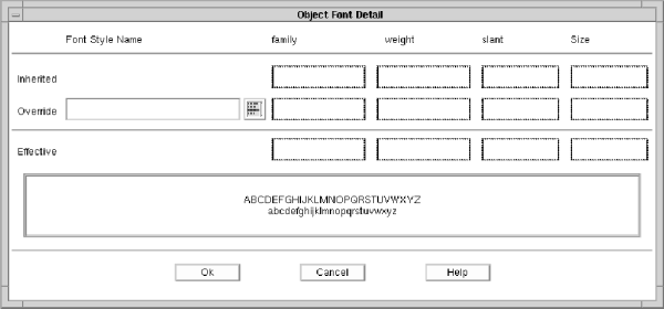
Figure 5-6 Object Font Detail
Click on the list button alongside the Override field. This brings up the Font Style List (similar to the Color Style List), which shows a list of all font styles known to the module you are in.
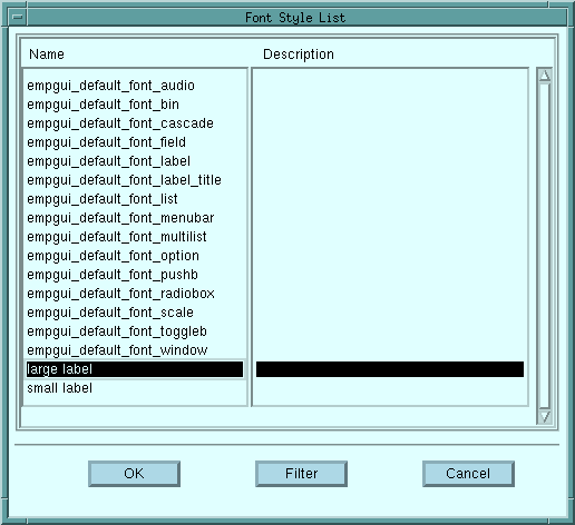
Figure 5-7 Font Style List
Scroll through the list, and select the large label font from the list.
Click on the OK button, and OK again, to get back to the Label Style Editor.
You will notice a curly f beside the Font Detail button, which indicates the presence of a named font style applied to this label style.
Click on File, Save & Exit.
You have defined a style for large labels. If you wish, you may repeat the process to create a small label style, suitable for applying to the field labels in your application.
Steps:
5.7 Create Push Button Style
If you commonly use push buttons in your application(s), it will be worthwhile
defining a standard look for them. You should now be at the Style Manager
screen.
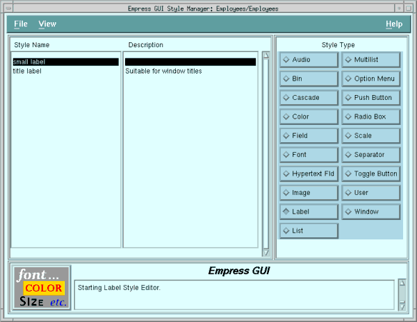
Figure 5-8 Style Manager box
To start creating styles for push buttons, select Push Button style type, and File, New.
Enter a name (say, Push Button Standard Style) and a description in the appropriate fields. Give a width and height. Try 100 pixels wide by 30 high.
(Your mileage may vary according to your screen resolution and available fonts.)
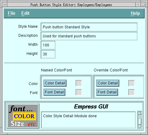
Figure 5-9 Font Style List
Within the Color Detail apply the color style pushbutton 1.
Within the Font Detail apply the small label font style.
When back at the Push Button Style Editor, press File, Save & Exit. Then press File, Exit to return to the Application Module Manager.
Congratulations, you have made the color styles, font styles, label styles, and push button style you need for your application. label styles.
The next step is to apply the label and push button styles to the labels and push buttons, (what else?).
5.8 Applying Styles to the Labels and Push Buttons
When you are back at the Application Module Manager, make sure that Employees
is selected. Select Tools, MAINWIN Component Editor from
the menu bar.
Select the title label (it says Employee Application), and bring up the Label Property Editor (by choosing File, Properties, or by clicking the third mouse button).
Click on the selection list box alongside the Style field.
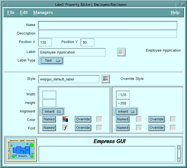
Figure 5-10
Select title label from the list. Press OK in the Label Style List.
Then File, Set & Exit in the Label Property Editor.
You should see the title appear in much larger type; in fact, you may have to expand the label to fit it in. The color you have chosen should be reflected in the label as well.
Select the field labels Name and Phone Number (one at a time), and apply the small label field style to both of them in the same way. Notice that if you have defined the override alignment for the Name label as right-aligned, the Name stays right-aligned, even if the style says left. To change this, make the override alignment Undefined.
Next, select each of the push buttons in the same way, and apply the Push Button Standard Style to each of them.
Save the window changes (File, Save & Exit) and run the application, (File, Run) within the Application Module Manager. See if you like the result.
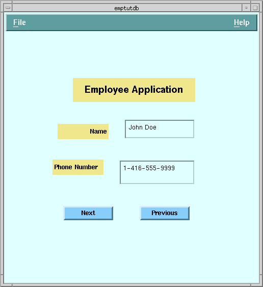
Figure 5-11
Try changing the color of the label 1 color style in the Color Style Manager. The steps are:
You have now seen the effect of applying styles and overriding some
aspects of them. Experiment with other choices (e.g., assigning a different
color and font style to the fields) until you understand the concept. You
will be able to change colors, fonts, and sometimes other characteristics
of all visible objects in the
application including windows themselves,
menu bars, fields, etc.